---
name: "Oura Ring"
mode: "light"
---

# Oura Ring

## Visual theme and atmosphere
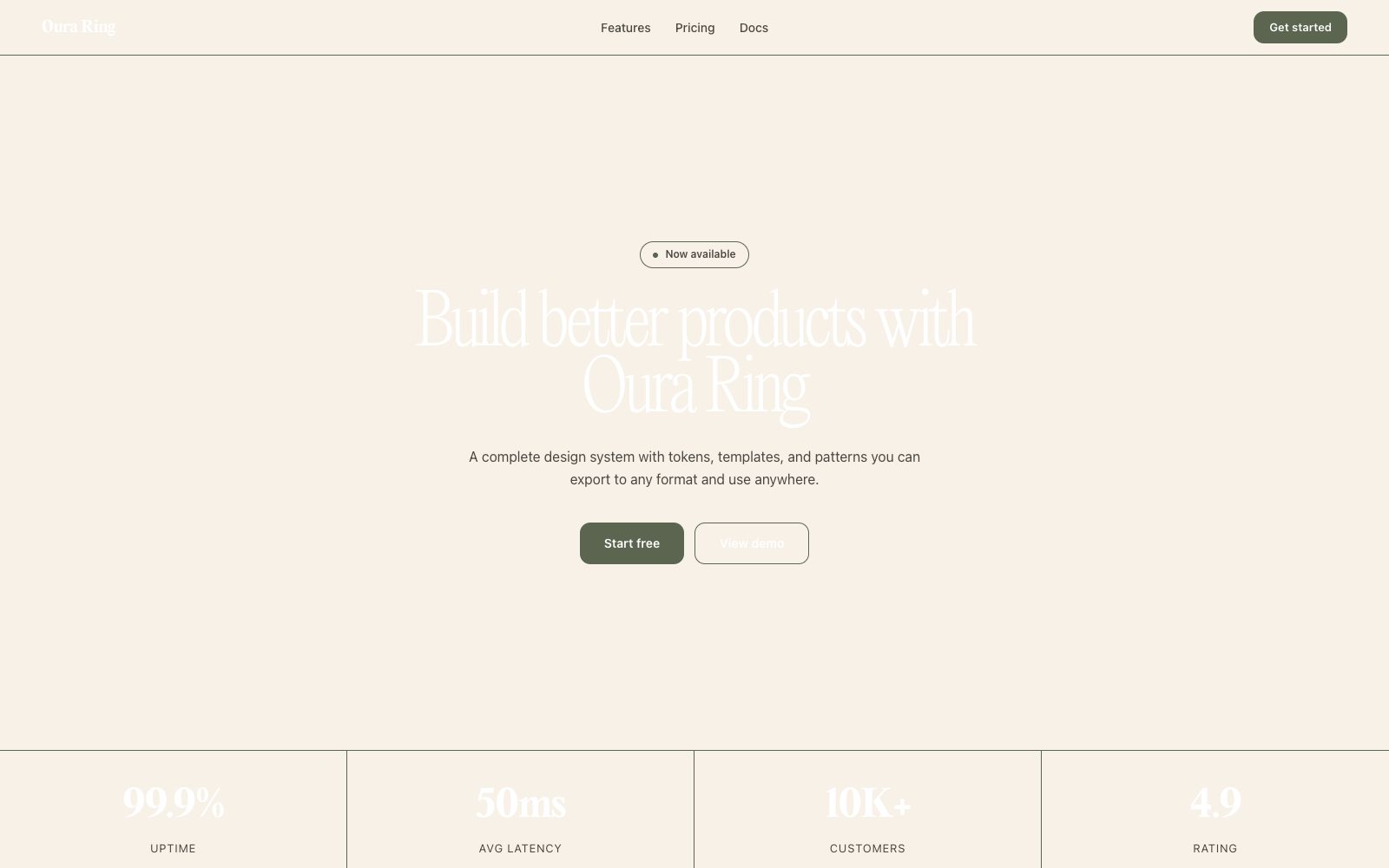
Luxury wellness, considered, warm, and tactile.

Warm oatmeal atelier under soft daylight — cream canvas, tactile photography, and wellness elegance.

## Color palette and roles
- **Cream (#f7f1e8)**: Page canvas — warm paper-white.
- **Pure White (#ffffff)**: Text on dark fills.
- **Pure Black (#000000)**: Dark text and strong contrast.
- **Soft Charcoal (#4a4741)**: Body copy and secondary headings.
- **Sage Whisper (#5b6550)**: Sole chromatic accent — icon strokes.
- **Stone Border (#ececec)**: Hairline dividers and card outlines.

## Typography rules
- **Display**: Editorial New, 300, 80px. Hero and emotional headlines — editorial serif.
- **Body**: AkkuratLL, 400, 16px. Body text, navigation, buttons, labels.
- **Label**: AkkuratLL, 700, 18px. Emphasis subheadings.

## Spacing and shape
- Base unit: 8px.
- Default gap: 16px.
- Card padding: 24px.
- Section padding: 80px.
- Card corners: 8px.
- Control corners: 12px.
- Pills: 9999px.

## Motion
Use restrained motion. Fast feedback lasts 140ms; composed transitions last 360ms; easing is cubic-bezier(0.16, 1, 0.3, 1).

## Guardrails
- Use Editorial New only for display headlines 30px and above.
- Default to #f7f1e8 cream as background — never pure white.
- Use 9999px radius for all buttons (pill shape).
- Do not apply drop shadows — use 1px #ececec borders.
---
name: "Oura Ring"
mode: "light"
---

# Oura Ring

## Visual theme and atmosphere
Luxury wellness, considered, warm, and tactile.

Warm oatmeal atelier under soft daylight — cream canvas, tactile photography, and wellness elegance.

## Color palette and roles
- **Cream (#f7f1e8)**: Page canvas — warm paper-white.
- **Pure White (#ffffff)**: Text on dark fills.
- **Pure Black (#000000)**: Dark text and strong contrast.
- **Soft Charcoal (#4a4741)**: Body copy and secondary headings.
- **Sage Whisper (#5b6550)**: Sole chromatic accent — icon strokes.
- **Stone Border (#ececec)**: Hairline dividers and card outlines.

## Typography rules
- **Display**: Editorial New, 300, 80px. Hero and emotional headlines — editorial serif.
- **Body**: AkkuratLL, 400, 16px. Body text, navigation, buttons, labels.
- **Label**: AkkuratLL, 700, 18px. Emphasis subheadings.

## Spacing and shape
- Base unit: 8px.
- Default gap: 16px.
- Card padding: 24px.
- Section padding: 80px.
- Card corners: 8px.
- Control corners: 12px.
- Pills: 9999px.

## Motion
Use restrained motion. Fast feedback lasts 140ms; composed transitions last 360ms; easing is cubic-bezier(0.16, 1, 0.3, 1).

## Guardrails
- Use Editorial New only for display headlines 30px and above.
- Default to #f7f1e8 cream as background — never pure white.
- Use 9999px radius for all buttons (pill shape).
- Do not apply drop shadows — use 1px #ececec borders.
---
name: "Oura Ring"
mode: "light"
---

# Oura Ring

## Visual theme and atmosphere
Luxury wellness, considered, warm, and tactile.

Warm oatmeal atelier under soft daylight — cream canvas, tactile photography, and wellness elegance.

## Color palette and roles
- **Cream (#f7f1e8)**: Page canvas — warm paper-white.
- **Pure White (#ffffff)**: Text on dark fills.
- **Pure Black (#000000)**: Dark text and strong contrast.
- **Soft Charcoal (#4a4741)**: Body copy and secondary headings.
- **Sage Whisper (#5b6550)**: Sole chromatic accent — icon strokes.
- **Stone Border (#ececec)**: Hairline dividers and card outlines.

## Typography rules
- **Display**: Editorial New, 300, 80px. Hero and emotional headlines — editorial serif.
- **Body**: AkkuratLL, 400, 16px. Body text, navigation, buttons, labels.
- **Label**: AkkuratLL, 700, 18px. Emphasis subheadings.

## Spacing and shape
- Base unit: 8px.
- Default gap: 16px.
- Card padding: 24px.
- Section padding: 80px.
- Card corners: 8px.
- Control corners: 12px.
- Pills: 9999px.

## Motion
Use restrained motion. Fast feedback lasts 140ms; composed transitions last 360ms; easing is cubic-bezier(0.16, 1, 0.3, 1).

## Guardrails
- Use Editorial New only for display headlines 30px and above.
- Default to #f7f1e8 cream as background — never pure white.
- Use 9999px radius for all buttons (pill shape).
- Do not apply drop shadows — use 1px #ececec borders.
---
name: "Oura Ring"
mode: "light"
---

# Oura Ring

## Visual theme and atmosphere
Luxury wellness, considered, warm, and tactile.

Warm oatmeal atelier under soft daylight — cream canvas, tactile photography, and wellness elegance.

## Color palette and roles
- **Cream (#f7f1e8)**: Page canvas — warm paper-white.
- **Pure White (#ffffff)**: Text on dark fills.
- **Pure Black (#000000)**: Dark text and strong contrast.
- **Soft Charcoal (#4a4741)**: Body copy and secondary headings.
- **Sage Whisper (#5b6550)**: Sole chromatic accent — icon strokes.
- **Stone Border (#ececec)**: Hairline dividers and card outlines.

## Typography rules
- **Display**: Editorial New, 300, 80px. Hero and emotional headlines — editorial serif.
- **Body**: AkkuratLL, 400, 16px. Body text, navigation, buttons, labels.
- **Label**: AkkuratLL, 700, 18px. Emphasis subheadings.

## Spacing and shape
- Base unit: 8px.
- Default gap: 16px.
- Card padding: 24px.
- Section padding: 80px.
- Card corners: 8px.
- Control corners: 12px.
- Pills: 9999px.

## Motion
Use restrained motion. Fast feedback lasts 140ms; composed transitions last 360ms; easing is cubic-bezier(0.16, 1, 0.3, 1).

## Guardrails
- Use Editorial New only for display headlines 30px and above.
- Default to #f7f1e8 cream as background — never pure white.
- Use 9999px radius for all buttons (pill shape).
- Do not apply drop shadows — use 1px #ececec borders.
---
name: "Oura Ring"
mode: "light"
---

# Oura Ring

## Visual theme and atmosphere
Luxury wellness, considered, warm, and tactile.

Warm oatmeal atelier under soft daylight — cream canvas, tactile photography, and wellness elegance.

## Color palette and roles
- **Cream (#f7f1e8)**: Page canvas — warm paper-white.
- **Pure White (#ffffff)**: Text on dark fills.
- **Pure Black (#000000)**: Dark text and strong contrast.
- **Soft Charcoal (#4a4741)**: Body copy and secondary headings.
- **Sage Whisper (#5b6550)**: Sole chromatic accent — icon strokes.
- **Stone Border (#ececec)**: Hairline dividers and card outlines.

## Typography rules
- **Display**: Editorial New, 300, 80px. Hero and emotional headlines — editorial serif.
- **Body**: AkkuratLL, 400, 16px. Body text, navigation, buttons, labels.
- **Label**: AkkuratLL, 700, 18px. Emphasis subheadings.

## Spacing and shape
- Base unit: 8px.
- Default gap: 16px.
- Card padding: 24px.
- Section padding: 80px.
- Card corners: 8px.
- Control corners: 12px.
- Pills: 9999px.

## Motion
Use restrained motion. Fast feedback lasts 140ms; composed transitions last 360ms; easing is cubic-bezier(0.16, 1, 0.3, 1).

## Guardrails
- Use Editorial New only for display headlines 30px and above.
- Default to #f7f1e8 cream as background — never pure white.
- Use 9999px radius for all buttons (pill shape).
- Do not apply drop shadows — use 1px #ececec borders.