---
name: "Lumen"
mode: "dark"
---

# Lumen

## Visual theme and atmosphere
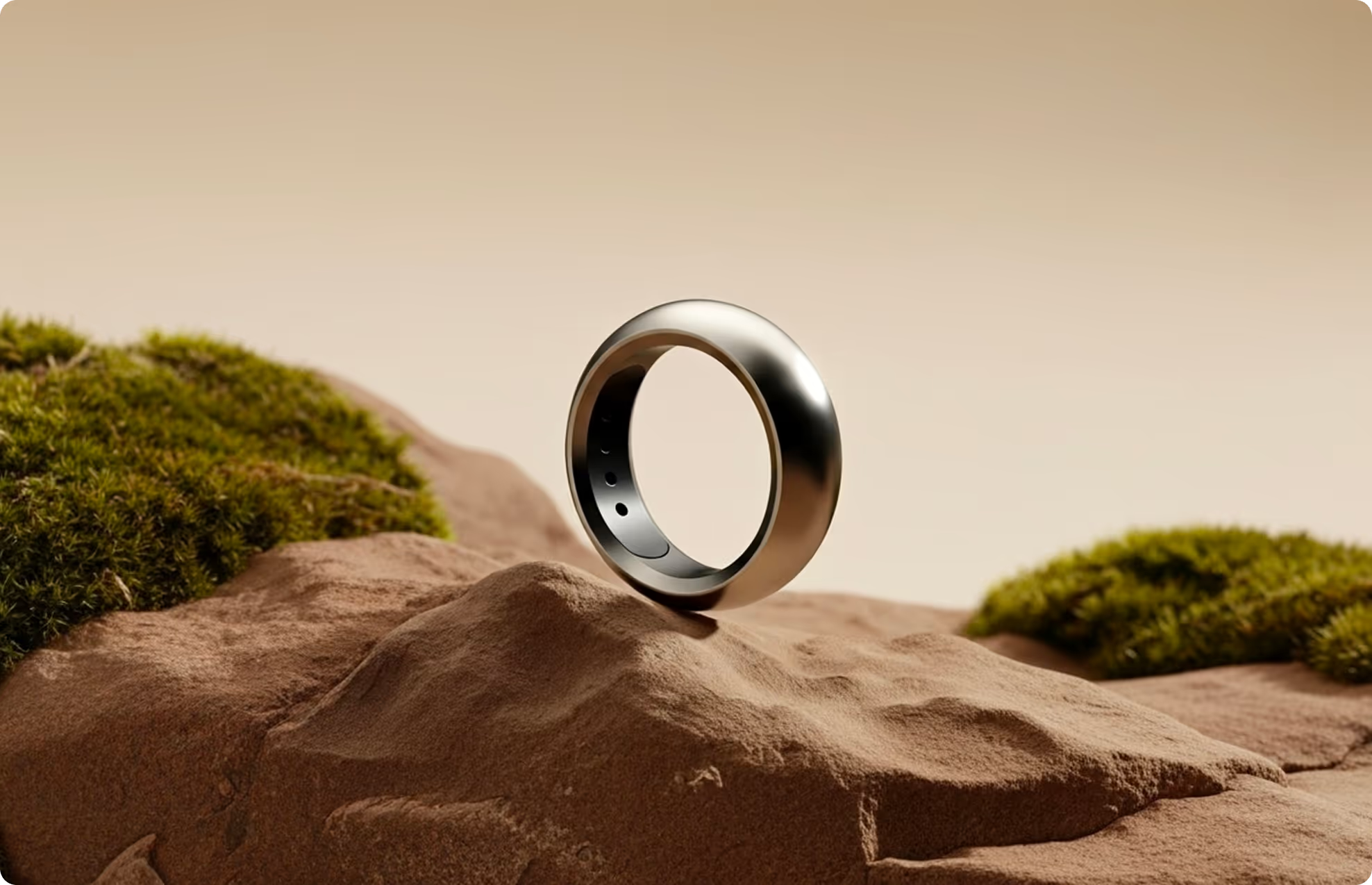
Lumen reads as premium wellness hardware: a warm, near-black canvas punctuated by a single hot-orange accent, framed by soft neutrals (gray, beige, steel) borrowed from studio photography. Fustat, a rounded-but-confident sans, carries everything from an 11.25rem display size down to 0.75rem captions, so the type system itself feels like a health dashboard — precise, legible, unfussy. Rounded 24px corners recur on every image, card and video tile, softening what would otherwise read as a cold fitness-tracker interface. Motion is proof-of-concept rather than decorative: autoplaying loop videos inside bento cards stand in for live biometric readouts, and full-bleed running/sleeping photography carries the emotional weight while the UI chrome stays quiet.

A health-tech smart-ring product page: warm charcoal-and-orange palette, oversized Fustat display type, a bento feature grid, and video-led proof points for sleep, balance, and performance.

## Color palette and roles
- **Primary Orange (#fc5c20)**: Primary CTA fill, small-button accent, focus rings.
- **Dark (#0c0c0d)**: Body text on light surfaces, dark section fills, footer background.
- **Gray (#dbd5ce)**: Neutral surface tint, card background, hairlines on dark.
- **Brown (#493625)**: Phone-mockup section background, tracking-tab section background.
- **Steel (#64605c)**: Secondary and muted body text.
- **Beige (#b4a592)**: Secondary surface accent, bento-card fallback fill.
- **Forest (#445900)**: Reserved accent token present in the source export.
- **White (#ffffff)**: Hero headline, button text on dark, card captions.
- **Black (#000000)**: Button hairline borders.

## Typography rules
- **Display**: Fustat, 600, clamp(2.5rem, 8vw, 5.875rem). Hero and section headlines.
- **Body**: Fustat, 400, 1.125rem. Paragraph copy, bullet callouts, form labels.
- **Caption**: Fustat, 500, 1rem. Bento-card captions and small UI labels.

## Spacing and shape
- Base unit: 10px.
- Default gap: 20px.
- Card padding: 40px.
- Section padding: 100px.
- Card corners: 24px.
- Control corners: 8px.
- Pills: 9999px.

## Motion
Use restrained motion. Fast feedback lasts 200ms; composed transitions last 500ms; easing is cubic-bezier(0.19, 1, 0.22, 1).

## Guardrails
- Use #fc5c20 only for primary CTAs and small accent buttons; do not use it for large text fills or backgrounds.
- Set display headlines in Fustat 600 with tight line-height; body copy in Fustat 400 at 18px (--fonts--body-regular).
- Round all photography, video tiles, and cards to 24px (--shapes--border-radius); buttons stay at 8px or full pill.
- Keep bento/feature cards photography-forward: caption text sits over a dark gradient scrim, not a solid fill.
- Use the 10px-based margin scale (4 through 120px tokens) for all spacing; do not introduce arbitrary values.
- Respect prefers-reduced-motion: freeze hero/scroll fades and autoplay videos to their poster frame; keep only hover/focus transitions.
---
name: "Lumen"
mode: "dark"
---

# Lumen

## Visual theme and atmosphere
Lumen reads as premium wellness hardware: a warm, near-black canvas punctuated by a single hot-orange accent, framed by soft neutrals (gray, beige, steel) borrowed from studio photography. Fustat, a rounded-but-confident sans, carries everything from an 11.25rem display size down to 0.75rem captions, so the type system itself feels like a health dashboard — precise, legible, unfussy. Rounded 24px corners recur on every image, card and video tile, softening what would otherwise read as a cold fitness-tracker interface. Motion is proof-of-concept rather than decorative: autoplaying loop videos inside bento cards stand in for live biometric readouts, and full-bleed running/sleeping photography carries the emotional weight while the UI chrome stays quiet.

A health-tech smart-ring product page: warm charcoal-and-orange palette, oversized Fustat display type, a bento feature grid, and video-led proof points for sleep, balance, and performance.

## Color palette and roles
- **Primary Orange (#fc5c20)**: Primary CTA fill, small-button accent, focus rings.
- **Dark (#0c0c0d)**: Body text on light surfaces, dark section fills, footer background.
- **Gray (#dbd5ce)**: Neutral surface tint, card background, hairlines on dark.
- **Brown (#493625)**: Phone-mockup section background, tracking-tab section background.
- **Steel (#64605c)**: Secondary and muted body text.
- **Beige (#b4a592)**: Secondary surface accent, bento-card fallback fill.
- **Forest (#445900)**: Reserved accent token present in the source export.
- **White (#ffffff)**: Hero headline, button text on dark, card captions.
- **Black (#000000)**: Button hairline borders.

## Typography rules
- **Display**: Fustat, 600, clamp(2.5rem, 8vw, 5.875rem). Hero and section headlines.
- **Body**: Fustat, 400, 1.125rem. Paragraph copy, bullet callouts, form labels.
- **Caption**: Fustat, 500, 1rem. Bento-card captions and small UI labels.

## Spacing and shape
- Base unit: 10px.
- Default gap: 20px.
- Card padding: 40px.
- Section padding: 100px.
- Card corners: 24px.
- Control corners: 8px.
- Pills: 9999px.

## Motion
Use restrained motion. Fast feedback lasts 200ms; composed transitions last 500ms; easing is cubic-bezier(0.19, 1, 0.22, 1).

## Guardrails
- Use #fc5c20 only for primary CTAs and small accent buttons; do not use it for large text fills or backgrounds.
- Set display headlines in Fustat 600 with tight line-height; body copy in Fustat 400 at 18px (--fonts--body-regular).
- Round all photography, video tiles, and cards to 24px (--shapes--border-radius); buttons stay at 8px or full pill.
- Keep bento/feature cards photography-forward: caption text sits over a dark gradient scrim, not a solid fill.
- Use the 10px-based margin scale (4 through 120px tokens) for all spacing; do not introduce arbitrary values.
- Respect prefers-reduced-motion: freeze hero/scroll fades and autoplay videos to their poster frame; keep only hover/focus transitions.
---
name: "Lumen"
mode: "dark"
---

# Lumen

## Visual theme and atmosphere
Lumen reads as premium wellness hardware: a warm, near-black canvas punctuated by a single hot-orange accent, framed by soft neutrals (gray, beige, steel) borrowed from studio photography. Fustat, a rounded-but-confident sans, carries everything from an 11.25rem display size down to 0.75rem captions, so the type system itself feels like a health dashboard — precise, legible, unfussy. Rounded 24px corners recur on every image, card and video tile, softening what would otherwise read as a cold fitness-tracker interface. Motion is proof-of-concept rather than decorative: autoplaying loop videos inside bento cards stand in for live biometric readouts, and full-bleed running/sleeping photography carries the emotional weight while the UI chrome stays quiet.

A health-tech smart-ring product page: warm charcoal-and-orange palette, oversized Fustat display type, a bento feature grid, and video-led proof points for sleep, balance, and performance.

## Color palette and roles
- **Primary Orange (#fc5c20)**: Primary CTA fill, small-button accent, focus rings.
- **Dark (#0c0c0d)**: Body text on light surfaces, dark section fills, footer background.
- **Gray (#dbd5ce)**: Neutral surface tint, card background, hairlines on dark.
- **Brown (#493625)**: Phone-mockup section background, tracking-tab section background.
- **Steel (#64605c)**: Secondary and muted body text.
- **Beige (#b4a592)**: Secondary surface accent, bento-card fallback fill.
- **Forest (#445900)**: Reserved accent token present in the source export.
- **White (#ffffff)**: Hero headline, button text on dark, card captions.
- **Black (#000000)**: Button hairline borders.

## Typography rules
- **Display**: Fustat, 600, clamp(2.5rem, 8vw, 5.875rem). Hero and section headlines.
- **Body**: Fustat, 400, 1.125rem. Paragraph copy, bullet callouts, form labels.
- **Caption**: Fustat, 500, 1rem. Bento-card captions and small UI labels.

## Spacing and shape
- Base unit: 10px.
- Default gap: 20px.
- Card padding: 40px.
- Section padding: 100px.
- Card corners: 24px.
- Control corners: 8px.
- Pills: 9999px.

## Motion
Use restrained motion. Fast feedback lasts 200ms; composed transitions last 500ms; easing is cubic-bezier(0.19, 1, 0.22, 1).

## Guardrails
- Use #fc5c20 only for primary CTAs and small accent buttons; do not use it for large text fills or backgrounds.
- Set display headlines in Fustat 600 with tight line-height; body copy in Fustat 400 at 18px (--fonts--body-regular).
- Round all photography, video tiles, and cards to 24px (--shapes--border-radius); buttons stay at 8px or full pill.
- Keep bento/feature cards photography-forward: caption text sits over a dark gradient scrim, not a solid fill.
- Use the 10px-based margin scale (4 through 120px tokens) for all spacing; do not introduce arbitrary values.
- Respect prefers-reduced-motion: freeze hero/scroll fades and autoplay videos to their poster frame; keep only hover/focus transitions.
---
name: "Lumen"
mode: "dark"
---

# Lumen

## Visual theme and atmosphere
Lumen reads as premium wellness hardware: a warm, near-black canvas punctuated by a single hot-orange accent, framed by soft neutrals (gray, beige, steel) borrowed from studio photography. Fustat, a rounded-but-confident sans, carries everything from an 11.25rem display size down to 0.75rem captions, so the type system itself feels like a health dashboard — precise, legible, unfussy. Rounded 24px corners recur on every image, card and video tile, softening what would otherwise read as a cold fitness-tracker interface. Motion is proof-of-concept rather than decorative: autoplaying loop videos inside bento cards stand in for live biometric readouts, and full-bleed running/sleeping photography carries the emotional weight while the UI chrome stays quiet.

A health-tech smart-ring product page: warm charcoal-and-orange palette, oversized Fustat display type, a bento feature grid, and video-led proof points for sleep, balance, and performance.

## Color palette and roles
- **Primary Orange (#fc5c20)**: Primary CTA fill, small-button accent, focus rings.
- **Dark (#0c0c0d)**: Body text on light surfaces, dark section fills, footer background.
- **Gray (#dbd5ce)**: Neutral surface tint, card background, hairlines on dark.
- **Brown (#493625)**: Phone-mockup section background, tracking-tab section background.
- **Steel (#64605c)**: Secondary and muted body text.
- **Beige (#b4a592)**: Secondary surface accent, bento-card fallback fill.
- **Forest (#445900)**: Reserved accent token present in the source export.
- **White (#ffffff)**: Hero headline, button text on dark, card captions.
- **Black (#000000)**: Button hairline borders.

## Typography rules
- **Display**: Fustat, 600, clamp(2.5rem, 8vw, 5.875rem). Hero and section headlines.
- **Body**: Fustat, 400, 1.125rem. Paragraph copy, bullet callouts, form labels.
- **Caption**: Fustat, 500, 1rem. Bento-card captions and small UI labels.

## Spacing and shape
- Base unit: 10px.
- Default gap: 20px.
- Card padding: 40px.
- Section padding: 100px.
- Card corners: 24px.
- Control corners: 8px.
- Pills: 9999px.

## Motion
Use restrained motion. Fast feedback lasts 200ms; composed transitions last 500ms; easing is cubic-bezier(0.19, 1, 0.22, 1).

## Guardrails
- Use #fc5c20 only for primary CTAs and small accent buttons; do not use it for large text fills or backgrounds.
- Set display headlines in Fustat 600 with tight line-height; body copy in Fustat 400 at 18px (--fonts--body-regular).
- Round all photography, video tiles, and cards to 24px (--shapes--border-radius); buttons stay at 8px or full pill.
- Keep bento/feature cards photography-forward: caption text sits over a dark gradient scrim, not a solid fill.
- Use the 10px-based margin scale (4 through 120px tokens) for all spacing; do not introduce arbitrary values.
- Respect prefers-reduced-motion: freeze hero/scroll fades and autoplay videos to their poster frame; keep only hover/focus transitions.
---
name: "Lumen"
mode: "dark"
---

# Lumen

## Visual theme and atmosphere
Lumen reads as premium wellness hardware: a warm, near-black canvas punctuated by a single hot-orange accent, framed by soft neutrals (gray, beige, steel) borrowed from studio photography. Fustat, a rounded-but-confident sans, carries everything from an 11.25rem display size down to 0.75rem captions, so the type system itself feels like a health dashboard — precise, legible, unfussy. Rounded 24px corners recur on every image, card and video tile, softening what would otherwise read as a cold fitness-tracker interface. Motion is proof-of-concept rather than decorative: autoplaying loop videos inside bento cards stand in for live biometric readouts, and full-bleed running/sleeping photography carries the emotional weight while the UI chrome stays quiet.

A health-tech smart-ring product page: warm charcoal-and-orange palette, oversized Fustat display type, a bento feature grid, and video-led proof points for sleep, balance, and performance.

## Color palette and roles
- **Primary Orange (#fc5c20)**: Primary CTA fill, small-button accent, focus rings.
- **Dark (#0c0c0d)**: Body text on light surfaces, dark section fills, footer background.
- **Gray (#dbd5ce)**: Neutral surface tint, card background, hairlines on dark.
- **Brown (#493625)**: Phone-mockup section background, tracking-tab section background.
- **Steel (#64605c)**: Secondary and muted body text.
- **Beige (#b4a592)**: Secondary surface accent, bento-card fallback fill.
- **Forest (#445900)**: Reserved accent token present in the source export.
- **White (#ffffff)**: Hero headline, button text on dark, card captions.
- **Black (#000000)**: Button hairline borders.

## Typography rules
- **Display**: Fustat, 600, clamp(2.5rem, 8vw, 5.875rem). Hero and section headlines.
- **Body**: Fustat, 400, 1.125rem. Paragraph copy, bullet callouts, form labels.
- **Caption**: Fustat, 500, 1rem. Bento-card captions and small UI labels.

## Spacing and shape
- Base unit: 10px.
- Default gap: 20px.
- Card padding: 40px.
- Section padding: 100px.
- Card corners: 24px.
- Control corners: 8px.
- Pills: 9999px.

## Motion
Use restrained motion. Fast feedback lasts 200ms; composed transitions last 500ms; easing is cubic-bezier(0.19, 1, 0.22, 1).

## Guardrails
- Use #fc5c20 only for primary CTAs and small accent buttons; do not use it for large text fills or backgrounds.
- Set display headlines in Fustat 600 with tight line-height; body copy in Fustat 400 at 18px (--fonts--body-regular).
- Round all photography, video tiles, and cards to 24px (--shapes--border-radius); buttons stay at 8px or full pill.
- Keep bento/feature cards photography-forward: caption text sits over a dark gradient scrim, not a solid fill.
- Use the 10px-based margin scale (4 through 120px tokens) for all spacing; do not introduce arbitrary values.
- Respect prefers-reduced-motion: freeze hero/scroll fades and autoplay videos to their poster frame; keep only hover/focus transitions.