---
name: "Linear"
mode: "dark"
---

# Linear

## Visual theme and atmosphere
Precise, functional, high-contrast, and deliberately monochrome with one acid punctuation.

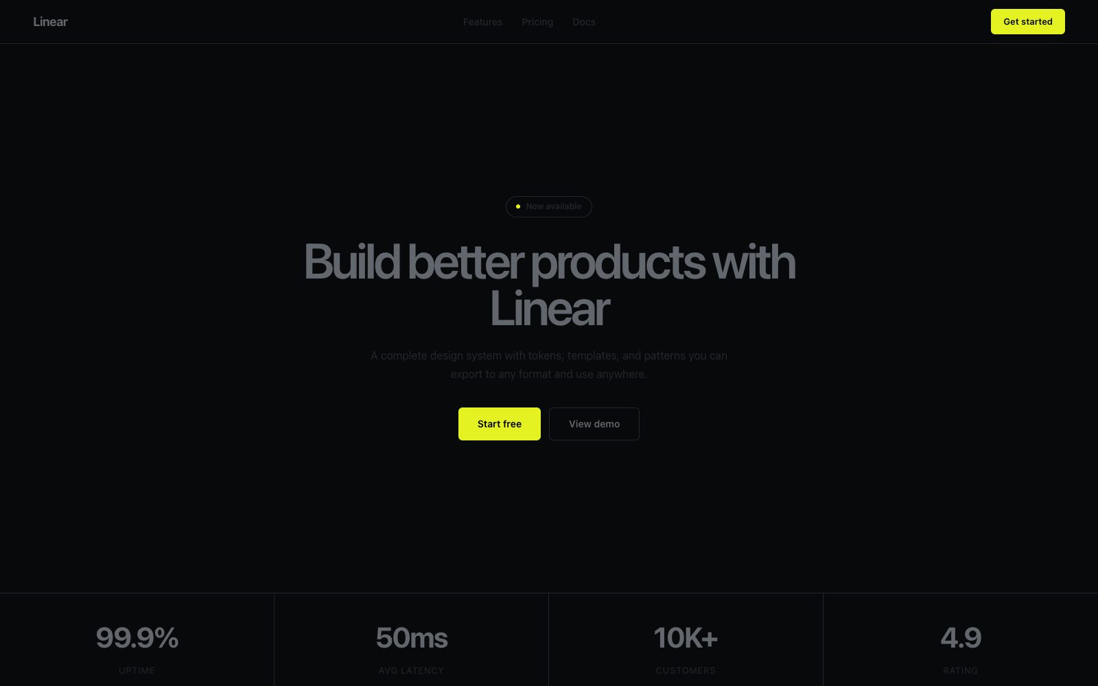
A midnight command center with paper-white type and an electric acid-lime accent.

## Color palette and roles
- **Void (#08090a)**: Page canvas, full-bleed backgrounds.
- **Carbon (#0f1011)**: Card surfaces, nav bars — one step above canvas.
- **Graphite (#23252a)**: Subtle borders, dividers, ghost button outlines.
- **Ash (#62666d)**: Muted body text, inactive icons.
- **Mist (#d0d6e0)**: Secondary headings, button text.
- **Paper (#ffffff)**: Primary headings, hero type.
- **Acid Lime (#e4f222)**: Primary action buttons, active nav indicators.
- **Iris Violet (#6366f1)**: Tag/badge fills — soft chromatic punctuation.

## Typography rules
- **Display**: Inter Variable, 590, 72px. Hero headlines.
- **Body**: Inter Variable, 400, 16px. UI and body copy.
- **Code**: Berkeley Mono, 400, 12px. Issue IDs, keyboard shortcuts.

## Spacing and shape
- Base unit: 8px.
- Default gap: 12px.
- Card padding: 24px.
- Section padding: 96px.
- Card corners: 12px.
- Control corners: 6px.
- Pills: 9999px.

## Motion
Use restrained motion. Fast feedback lasts 100ms; composed transitions last 300ms; easing is cubic-bezier(0.16, 1, 0.3, 1).

## Guardrails
- Use Acid Lime exclusively for the single primary action per view.
- Set body text at 16px Inter weight 400 with line-height 1.5.
- Use letter-spacing -0.022em at 48px and above.
- Do not use bold weights (700+) — cap at weight 590.
- Do not use decorative gradients on buttons or cards.
- Use hairline borders (#23252a) instead of shadows for elevation.
---
name: "Linear"
mode: "dark"
---

# Linear

## Visual theme and atmosphere
Precise, functional, high-contrast, and deliberately monochrome with one acid punctuation.

A midnight command center with paper-white type and an electric acid-lime accent.

## Color palette and roles
- **Void (#08090a)**: Page canvas, full-bleed backgrounds.
- **Carbon (#0f1011)**: Card surfaces, nav bars — one step above canvas.
- **Graphite (#23252a)**: Subtle borders, dividers, ghost button outlines.
- **Ash (#62666d)**: Muted body text, inactive icons.
- **Mist (#d0d6e0)**: Secondary headings, button text.
- **Paper (#ffffff)**: Primary headings, hero type.
- **Acid Lime (#e4f222)**: Primary action buttons, active nav indicators.
- **Iris Violet (#6366f1)**: Tag/badge fills — soft chromatic punctuation.

## Typography rules
- **Display**: Inter Variable, 590, 72px. Hero headlines.
- **Body**: Inter Variable, 400, 16px. UI and body copy.
- **Code**: Berkeley Mono, 400, 12px. Issue IDs, keyboard shortcuts.

## Spacing and shape
- Base unit: 8px.
- Default gap: 12px.
- Card padding: 24px.
- Section padding: 96px.
- Card corners: 12px.
- Control corners: 6px.
- Pills: 9999px.

## Motion
Use restrained motion. Fast feedback lasts 100ms; composed transitions last 300ms; easing is cubic-bezier(0.16, 1, 0.3, 1).

## Guardrails
- Use Acid Lime exclusively for the single primary action per view.
- Set body text at 16px Inter weight 400 with line-height 1.5.
- Use letter-spacing -0.022em at 48px and above.
- Do not use bold weights (700+) — cap at weight 590.
- Do not use decorative gradients on buttons or cards.
- Use hairline borders (#23252a) instead of shadows for elevation.
---
name: "Linear"
mode: "dark"
---

# Linear

## Visual theme and atmosphere
Precise, functional, high-contrast, and deliberately monochrome with one acid punctuation.

A midnight command center with paper-white type and an electric acid-lime accent.

## Color palette and roles
- **Void (#08090a)**: Page canvas, full-bleed backgrounds.
- **Carbon (#0f1011)**: Card surfaces, nav bars — one step above canvas.
- **Graphite (#23252a)**: Subtle borders, dividers, ghost button outlines.
- **Ash (#62666d)**: Muted body text, inactive icons.
- **Mist (#d0d6e0)**: Secondary headings, button text.
- **Paper (#ffffff)**: Primary headings, hero type.
- **Acid Lime (#e4f222)**: Primary action buttons, active nav indicators.
- **Iris Violet (#6366f1)**: Tag/badge fills — soft chromatic punctuation.

## Typography rules
- **Display**: Inter Variable, 590, 72px. Hero headlines.
- **Body**: Inter Variable, 400, 16px. UI and body copy.
- **Code**: Berkeley Mono, 400, 12px. Issue IDs, keyboard shortcuts.

## Spacing and shape
- Base unit: 8px.
- Default gap: 12px.
- Card padding: 24px.
- Section padding: 96px.
- Card corners: 12px.
- Control corners: 6px.
- Pills: 9999px.

## Motion
Use restrained motion. Fast feedback lasts 100ms; composed transitions last 300ms; easing is cubic-bezier(0.16, 1, 0.3, 1).

## Guardrails
- Use Acid Lime exclusively for the single primary action per view.
- Set body text at 16px Inter weight 400 with line-height 1.5.
- Use letter-spacing -0.022em at 48px and above.
- Do not use bold weights (700+) — cap at weight 590.
- Do not use decorative gradients on buttons or cards.
- Use hairline borders (#23252a) instead of shadows for elevation.
---
name: "Linear"
mode: "dark"
---

# Linear

## Visual theme and atmosphere
Precise, functional, high-contrast, and deliberately monochrome with one acid punctuation.

A midnight command center with paper-white type and an electric acid-lime accent.

## Color palette and roles
- **Void (#08090a)**: Page canvas, full-bleed backgrounds.
- **Carbon (#0f1011)**: Card surfaces, nav bars — one step above canvas.
- **Graphite (#23252a)**: Subtle borders, dividers, ghost button outlines.
- **Ash (#62666d)**: Muted body text, inactive icons.
- **Mist (#d0d6e0)**: Secondary headings, button text.
- **Paper (#ffffff)**: Primary headings, hero type.
- **Acid Lime (#e4f222)**: Primary action buttons, active nav indicators.
- **Iris Violet (#6366f1)**: Tag/badge fills — soft chromatic punctuation.

## Typography rules
- **Display**: Inter Variable, 590, 72px. Hero headlines.
- **Body**: Inter Variable, 400, 16px. UI and body copy.
- **Code**: Berkeley Mono, 400, 12px. Issue IDs, keyboard shortcuts.

## Spacing and shape
- Base unit: 8px.
- Default gap: 12px.
- Card padding: 24px.
- Section padding: 96px.
- Card corners: 12px.
- Control corners: 6px.
- Pills: 9999px.

## Motion
Use restrained motion. Fast feedback lasts 100ms; composed transitions last 300ms; easing is cubic-bezier(0.16, 1, 0.3, 1).

## Guardrails
- Use Acid Lime exclusively for the single primary action per view.
- Set body text at 16px Inter weight 400 with line-height 1.5.
- Use letter-spacing -0.022em at 48px and above.
- Do not use bold weights (700+) — cap at weight 590.
- Do not use decorative gradients on buttons or cards.
- Use hairline borders (#23252a) instead of shadows for elevation.
---
name: "Linear"
mode: "dark"
---

# Linear

## Visual theme and atmosphere
Precise, functional, high-contrast, and deliberately monochrome with one acid punctuation.

A midnight command center with paper-white type and an electric acid-lime accent.

## Color palette and roles
- **Void (#08090a)**: Page canvas, full-bleed backgrounds.
- **Carbon (#0f1011)**: Card surfaces, nav bars — one step above canvas.
- **Graphite (#23252a)**: Subtle borders, dividers, ghost button outlines.
- **Ash (#62666d)**: Muted body text, inactive icons.
- **Mist (#d0d6e0)**: Secondary headings, button text.
- **Paper (#ffffff)**: Primary headings, hero type.
- **Acid Lime (#e4f222)**: Primary action buttons, active nav indicators.
- **Iris Violet (#6366f1)**: Tag/badge fills — soft chromatic punctuation.

## Typography rules
- **Display**: Inter Variable, 590, 72px. Hero headlines.
- **Body**: Inter Variable, 400, 16px. UI and body copy.
- **Code**: Berkeley Mono, 400, 12px. Issue IDs, keyboard shortcuts.

## Spacing and shape
- Base unit: 8px.
- Default gap: 12px.
- Card padding: 24px.
- Section padding: 96px.
- Card corners: 12px.
- Control corners: 6px.
- Pills: 9999px.

## Motion
Use restrained motion. Fast feedback lasts 100ms; composed transitions last 300ms; easing is cubic-bezier(0.16, 1, 0.3, 1).

## Guardrails
- Use Acid Lime exclusively for the single primary action per view.
- Set body text at 16px Inter weight 400 with line-height 1.5.
- Use letter-spacing -0.022em at 48px and above.
- Do not use bold weights (700+) — cap at weight 590.
- Do not use decorative gradients on buttons or cards.
- Use hairline borders (#23252a) instead of shadows for elevation.