---
name: "Resend"
mode: "dark"
---

# Resend

## Visual theme and atmosphere
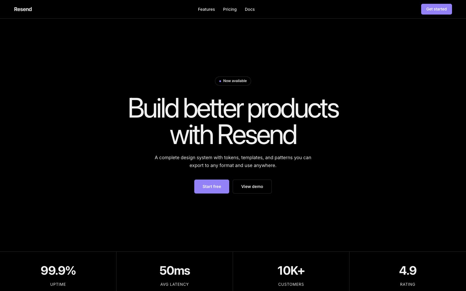
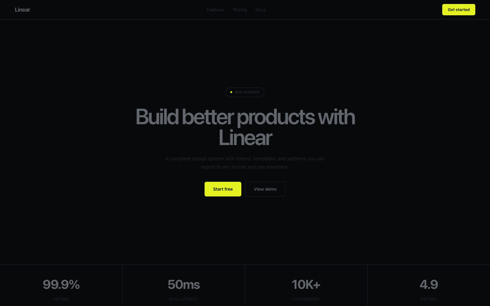
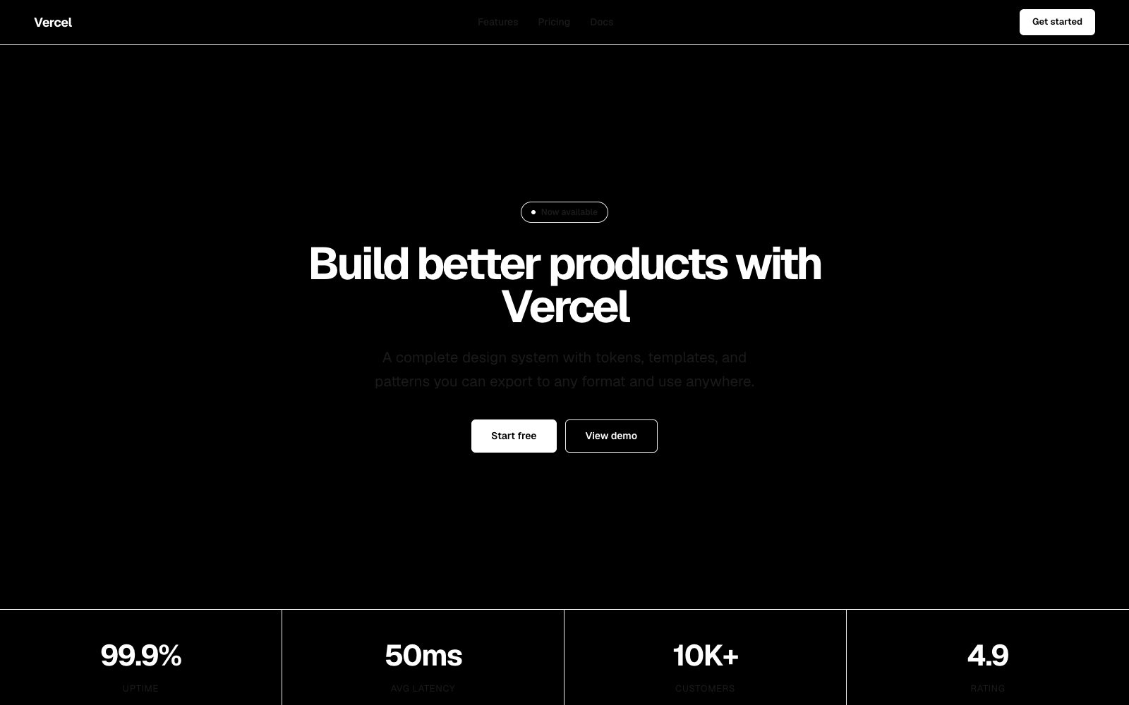
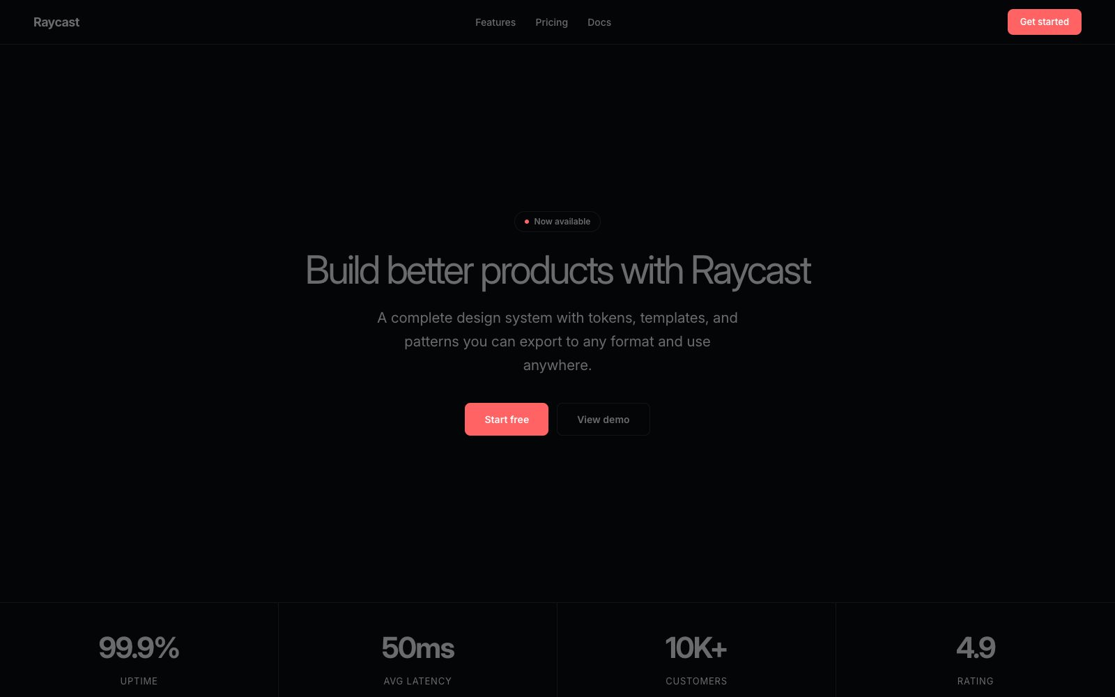
Minimal, developer-grade, violet-tinged darkness.

Black velvet with violet neon — pure black canvas, hairline borders, and iris accent.

## Color palette and roles
- **Void Black (#000000)**: Page background, card surfaces — the entire canvas.
- **Graphite Hairline (#292d30)**: 1px borders on cards, inputs, dividers.
- **Bone White (#f0f0f0)**: Body text, secondary headings.
- **Ash Gray (#a1a4a5)**: Muted body text, badge labels.
- **Iris Violet (#9281f7)**: Violet text accent for links, tags.
- **Signal Blue (#3b9eff)**: Blue action color for filled buttons.

## Typography rules
- **Hero**: Domaine, 400, 96px. Hero display type — editorial feel.
- **Headline**: aBC Favorit, 400, 56px. Section headlines.
- **Body**: Inter, 400, 16px. Body copy, UI labels, navigation.
- **Code**: Commit Mono, 400, 12px. Code blocks, terminal-style badges.

## Spacing and shape
- Base unit: 8px.
- Default gap: 16px.
- Card padding: 24px.
- Section padding: 96px.
- Card corners: 16px.
- Control corners: 6px.
- Pills: 9999px.

## Motion
Use restrained motion. Fast feedback lasts 120ms; composed transitions last 300ms; easing is cubic-bezier(0.16, 1, 0.3, 1).

## Guardrails
- Use pure #000000 as the page canvas.
- Separate layers with 1px borders in #292d30, not shadows.
- Keep buttons ghost/outlined: transparent fill, 1px border, white text.
- Do not use filled accent-color buttons as primary actions.
- Do not add gradients or chromatic washes to backgrounds.
---
name: "Resend"
mode: "dark"
---

# Resend

## Visual theme and atmosphere
Minimal, developer-grade, violet-tinged darkness.

Black velvet with violet neon — pure black canvas, hairline borders, and iris accent.

## Color palette and roles
- **Void Black (#000000)**: Page background, card surfaces — the entire canvas.
- **Graphite Hairline (#292d30)**: 1px borders on cards, inputs, dividers.
- **Bone White (#f0f0f0)**: Body text, secondary headings.
- **Ash Gray (#a1a4a5)**: Muted body text, badge labels.
- **Iris Violet (#9281f7)**: Violet text accent for links, tags.
- **Signal Blue (#3b9eff)**: Blue action color for filled buttons.

## Typography rules
- **Hero**: Domaine, 400, 96px. Hero display type — editorial feel.
- **Headline**: aBC Favorit, 400, 56px. Section headlines.
- **Body**: Inter, 400, 16px. Body copy, UI labels, navigation.
- **Code**: Commit Mono, 400, 12px. Code blocks, terminal-style badges.

## Spacing and shape
- Base unit: 8px.
- Default gap: 16px.
- Card padding: 24px.
- Section padding: 96px.
- Card corners: 16px.
- Control corners: 6px.
- Pills: 9999px.

## Motion
Use restrained motion. Fast feedback lasts 120ms; composed transitions last 300ms; easing is cubic-bezier(0.16, 1, 0.3, 1).

## Guardrails
- Use pure #000000 as the page canvas.
- Separate layers with 1px borders in #292d30, not shadows.
- Keep buttons ghost/outlined: transparent fill, 1px border, white text.
- Do not use filled accent-color buttons as primary actions.
- Do not add gradients or chromatic washes to backgrounds.
---
name: "Resend"
mode: "dark"
---

# Resend

## Visual theme and atmosphere
Minimal, developer-grade, violet-tinged darkness.

Black velvet with violet neon — pure black canvas, hairline borders, and iris accent.

## Color palette and roles
- **Void Black (#000000)**: Page background, card surfaces — the entire canvas.
- **Graphite Hairline (#292d30)**: 1px borders on cards, inputs, dividers.
- **Bone White (#f0f0f0)**: Body text, secondary headings.
- **Ash Gray (#a1a4a5)**: Muted body text, badge labels.
- **Iris Violet (#9281f7)**: Violet text accent for links, tags.
- **Signal Blue (#3b9eff)**: Blue action color for filled buttons.

## Typography rules
- **Hero**: Domaine, 400, 96px. Hero display type — editorial feel.
- **Headline**: aBC Favorit, 400, 56px. Section headlines.
- **Body**: Inter, 400, 16px. Body copy, UI labels, navigation.
- **Code**: Commit Mono, 400, 12px. Code blocks, terminal-style badges.

## Spacing and shape
- Base unit: 8px.
- Default gap: 16px.
- Card padding: 24px.
- Section padding: 96px.
- Card corners: 16px.
- Control corners: 6px.
- Pills: 9999px.

## Motion
Use restrained motion. Fast feedback lasts 120ms; composed transitions last 300ms; easing is cubic-bezier(0.16, 1, 0.3, 1).

## Guardrails
- Use pure #000000 as the page canvas.
- Separate layers with 1px borders in #292d30, not shadows.
- Keep buttons ghost/outlined: transparent fill, 1px border, white text.
- Do not use filled accent-color buttons as primary actions.
- Do not add gradients or chromatic washes to backgrounds.
---
name: "Resend"
mode: "dark"
---

# Resend

## Visual theme and atmosphere
Minimal, developer-grade, violet-tinged darkness.

Black velvet with violet neon — pure black canvas, hairline borders, and iris accent.

## Color palette and roles
- **Void Black (#000000)**: Page background, card surfaces — the entire canvas.
- **Graphite Hairline (#292d30)**: 1px borders on cards, inputs, dividers.
- **Bone White (#f0f0f0)**: Body text, secondary headings.
- **Ash Gray (#a1a4a5)**: Muted body text, badge labels.
- **Iris Violet (#9281f7)**: Violet text accent for links, tags.
- **Signal Blue (#3b9eff)**: Blue action color for filled buttons.

## Typography rules
- **Hero**: Domaine, 400, 96px. Hero display type — editorial feel.
- **Headline**: aBC Favorit, 400, 56px. Section headlines.
- **Body**: Inter, 400, 16px. Body copy, UI labels, navigation.
- **Code**: Commit Mono, 400, 12px. Code blocks, terminal-style badges.

## Spacing and shape
- Base unit: 8px.
- Default gap: 16px.
- Card padding: 24px.
- Section padding: 96px.
- Card corners: 16px.
- Control corners: 6px.
- Pills: 9999px.

## Motion
Use restrained motion. Fast feedback lasts 120ms; composed transitions last 300ms; easing is cubic-bezier(0.16, 1, 0.3, 1).

## Guardrails
- Use pure #000000 as the page canvas.
- Separate layers with 1px borders in #292d30, not shadows.
- Keep buttons ghost/outlined: transparent fill, 1px border, white text.
- Do not use filled accent-color buttons as primary actions.
- Do not add gradients or chromatic washes to backgrounds.
---
name: "Resend"
mode: "dark"
---

# Resend

## Visual theme and atmosphere
Minimal, developer-grade, violet-tinged darkness.

Black velvet with violet neon — pure black canvas, hairline borders, and iris accent.

## Color palette and roles
- **Void Black (#000000)**: Page background, card surfaces — the entire canvas.
- **Graphite Hairline (#292d30)**: 1px borders on cards, inputs, dividers.
- **Bone White (#f0f0f0)**: Body text, secondary headings.
- **Ash Gray (#a1a4a5)**: Muted body text, badge labels.
- **Iris Violet (#9281f7)**: Violet text accent for links, tags.
- **Signal Blue (#3b9eff)**: Blue action color for filled buttons.

## Typography rules
- **Hero**: Domaine, 400, 96px. Hero display type — editorial feel.
- **Headline**: aBC Favorit, 400, 56px. Section headlines.
- **Body**: Inter, 400, 16px. Body copy, UI labels, navigation.
- **Code**: Commit Mono, 400, 12px. Code blocks, terminal-style badges.

## Spacing and shape
- Base unit: 8px.
- Default gap: 16px.
- Card padding: 24px.
- Section padding: 96px.
- Card corners: 16px.
- Control corners: 6px.
- Pills: 9999px.

## Motion
Use restrained motion. Fast feedback lasts 120ms; composed transitions last 300ms; easing is cubic-bezier(0.16, 1, 0.3, 1).

## Guardrails
- Use pure #000000 as the page canvas.
- Separate layers with 1px borders in #292d30, not shadows.
- Keep buttons ghost/outlined: transparent fill, 1px border, white text.
- Do not use filled accent-color buttons as primary actions.
- Do not add gradients or chromatic washes to backgrounds.