---
name: "Vercel"
mode: "dark"
---

# Vercel

## Visual theme and atmosphere
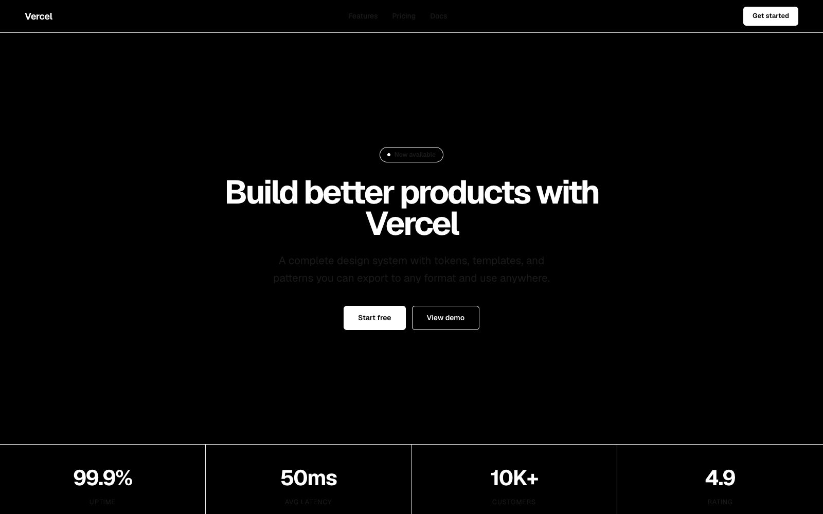
Monochrome austerity. Every pixel earns its place. No gradients, no color, no ornament.

Absolute black-and-white purity with geometric precision and zero decorative noise.

## Color palette and roles
- **Black (#000000)**: Page canvas, primary surface.
- **Gray 900 (#111111)**: Card backgrounds, elevated surfaces.
- **Gray 800 (#1a1a1a)**: Input fills, subtle hover.
- **Gray 600 (#666666)**: Muted text, placeholder.
- **Gray 400 (#999999)**: Secondary labels.
- **Gray 100 (#ededed)**: Borders, dividers.
- **White (#ffffff)**: Primary text, CTA foreground.
- **Blue (#0070f3)**: Links, active nav indicators.

## Typography rules
- **Display**: Geist, 700, 64px. Landing page headlines.
- **Body**: Geist, 400, 16px. Documentation and UI text.
- **Code**: Geist Mono, 400, 14px. Terminal, config, code samples.

## Spacing and shape
- Base unit: 8px.
- Default gap: 16px.
- Card padding: 24px.
- Section padding: 80px.
- Card corners: 8px.
- Control corners: 6px.
- Pills: 9999px.

## Motion
Use restrained motion. Fast feedback lasts 100ms; composed transitions last 200ms; easing is cubic-bezier(0.16, 1, 0.3, 1).

## Guardrails
- Never use color for decoration — blue is reserved for interactive elements.
- Use Geist for all UI text; Geist Mono for all code contexts.
- Limit border radius to 8px on containers and 6px on controls.
- Use 1px solid #333 borders for all card separation — no shadows.
- Keep animations under 200ms — the interface should feel instant.
---
name: "Vercel"
mode: "dark"
---

# Vercel

## Visual theme and atmosphere
Monochrome austerity. Every pixel earns its place. No gradients, no color, no ornament.

Absolute black-and-white purity with geometric precision and zero decorative noise.

## Color palette and roles
- **Black (#000000)**: Page canvas, primary surface.
- **Gray 900 (#111111)**: Card backgrounds, elevated surfaces.
- **Gray 800 (#1a1a1a)**: Input fills, subtle hover.
- **Gray 600 (#666666)**: Muted text, placeholder.
- **Gray 400 (#999999)**: Secondary labels.
- **Gray 100 (#ededed)**: Borders, dividers.
- **White (#ffffff)**: Primary text, CTA foreground.
- **Blue (#0070f3)**: Links, active nav indicators.

## Typography rules
- **Display**: Geist, 700, 64px. Landing page headlines.
- **Body**: Geist, 400, 16px. Documentation and UI text.
- **Code**: Geist Mono, 400, 14px. Terminal, config, code samples.

## Spacing and shape
- Base unit: 8px.
- Default gap: 16px.
- Card padding: 24px.
- Section padding: 80px.
- Card corners: 8px.
- Control corners: 6px.
- Pills: 9999px.

## Motion
Use restrained motion. Fast feedback lasts 100ms; composed transitions last 200ms; easing is cubic-bezier(0.16, 1, 0.3, 1).

## Guardrails
- Never use color for decoration — blue is reserved for interactive elements.
- Use Geist for all UI text; Geist Mono for all code contexts.
- Limit border radius to 8px on containers and 6px on controls.
- Use 1px solid #333 borders for all card separation — no shadows.
- Keep animations under 200ms — the interface should feel instant.
---
name: "Vercel"
mode: "dark"
---

# Vercel

## Visual theme and atmosphere
Monochrome austerity. Every pixel earns its place. No gradients, no color, no ornament.

Absolute black-and-white purity with geometric precision and zero decorative noise.

## Color palette and roles
- **Black (#000000)**: Page canvas, primary surface.
- **Gray 900 (#111111)**: Card backgrounds, elevated surfaces.
- **Gray 800 (#1a1a1a)**: Input fills, subtle hover.
- **Gray 600 (#666666)**: Muted text, placeholder.
- **Gray 400 (#999999)**: Secondary labels.
- **Gray 100 (#ededed)**: Borders, dividers.
- **White (#ffffff)**: Primary text, CTA foreground.
- **Blue (#0070f3)**: Links, active nav indicators.

## Typography rules
- **Display**: Geist, 700, 64px. Landing page headlines.
- **Body**: Geist, 400, 16px. Documentation and UI text.
- **Code**: Geist Mono, 400, 14px. Terminal, config, code samples.

## Spacing and shape
- Base unit: 8px.
- Default gap: 16px.
- Card padding: 24px.
- Section padding: 80px.
- Card corners: 8px.
- Control corners: 6px.
- Pills: 9999px.

## Motion
Use restrained motion. Fast feedback lasts 100ms; composed transitions last 200ms; easing is cubic-bezier(0.16, 1, 0.3, 1).

## Guardrails
- Never use color for decoration — blue is reserved for interactive elements.
- Use Geist for all UI text; Geist Mono for all code contexts.
- Limit border radius to 8px on containers and 6px on controls.
- Use 1px solid #333 borders for all card separation — no shadows.
- Keep animations under 200ms — the interface should feel instant.
---
name: "Vercel"
mode: "dark"
---

# Vercel

## Visual theme and atmosphere
Monochrome austerity. Every pixel earns its place. No gradients, no color, no ornament.

Absolute black-and-white purity with geometric precision and zero decorative noise.

## Color palette and roles
- **Black (#000000)**: Page canvas, primary surface.
- **Gray 900 (#111111)**: Card backgrounds, elevated surfaces.
- **Gray 800 (#1a1a1a)**: Input fills, subtle hover.
- **Gray 600 (#666666)**: Muted text, placeholder.
- **Gray 400 (#999999)**: Secondary labels.
- **Gray 100 (#ededed)**: Borders, dividers.
- **White (#ffffff)**: Primary text, CTA foreground.
- **Blue (#0070f3)**: Links, active nav indicators.

## Typography rules
- **Display**: Geist, 700, 64px. Landing page headlines.
- **Body**: Geist, 400, 16px. Documentation and UI text.
- **Code**: Geist Mono, 400, 14px. Terminal, config, code samples.

## Spacing and shape
- Base unit: 8px.
- Default gap: 16px.
- Card padding: 24px.
- Section padding: 80px.
- Card corners: 8px.
- Control corners: 6px.
- Pills: 9999px.

## Motion
Use restrained motion. Fast feedback lasts 100ms; composed transitions last 200ms; easing is cubic-bezier(0.16, 1, 0.3, 1).

## Guardrails
- Never use color for decoration — blue is reserved for interactive elements.
- Use Geist for all UI text; Geist Mono for all code contexts.
- Limit border radius to 8px on containers and 6px on controls.
- Use 1px solid #333 borders for all card separation — no shadows.
- Keep animations under 200ms — the interface should feel instant.
---
name: "Vercel"
mode: "dark"
---

# Vercel

## Visual theme and atmosphere
Monochrome austerity. Every pixel earns its place. No gradients, no color, no ornament.

Absolute black-and-white purity with geometric precision and zero decorative noise.

## Color palette and roles
- **Black (#000000)**: Page canvas, primary surface.
- **Gray 900 (#111111)**: Card backgrounds, elevated surfaces.
- **Gray 800 (#1a1a1a)**: Input fills, subtle hover.
- **Gray 600 (#666666)**: Muted text, placeholder.
- **Gray 400 (#999999)**: Secondary labels.
- **Gray 100 (#ededed)**: Borders, dividers.
- **White (#ffffff)**: Primary text, CTA foreground.
- **Blue (#0070f3)**: Links, active nav indicators.

## Typography rules
- **Display**: Geist, 700, 64px. Landing page headlines.
- **Body**: Geist, 400, 16px. Documentation and UI text.
- **Code**: Geist Mono, 400, 14px. Terminal, config, code samples.

## Spacing and shape
- Base unit: 8px.
- Default gap: 16px.
- Card padding: 24px.
- Section padding: 80px.
- Card corners: 8px.
- Control corners: 6px.
- Pills: 9999px.

## Motion
Use restrained motion. Fast feedback lasts 100ms; composed transitions last 200ms; easing is cubic-bezier(0.16, 1, 0.3, 1).

## Guardrails
- Never use color for decoration — blue is reserved for interactive elements.
- Use Geist for all UI text; Geist Mono for all code contexts.
- Limit border radius to 8px on containers and 6px on controls.
- Use 1px solid #333 borders for all card separation — no shadows.
- Keep animations under 200ms — the interface should feel instant.