---
name: "Mercury"
mode: "dark"
---

# Mercury

## Visual theme and atmosphere
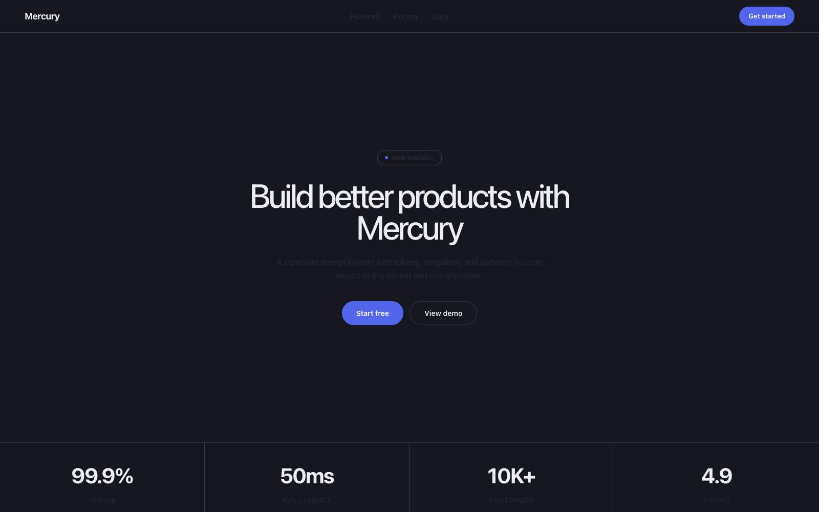
Cinematic, observatory-like, premium fintech darkness.

Alpine banking aesthetic — near-black canvas where content surfaces float as glass panes.

## Color palette and roles
- **Onyx Canvas (#171721)**: Dominant page background.
- **Graphite Card (#1e1e2a)**: Elevated card and section surfaces.
- **Obsidian Button (#272735)**: Secondary button fills, input backgrounds.
- **Ivory Text (#ededf3)**: Primary text, icons, nav items.
- **Ash Text (#c3c3cc)**: Muted body copy, helper text.
- **Cobalt (#5266eb)**: Violet action color for filled buttons.

## Typography rules
- **Display**: arcadiaDisplay, 480, 65px. Headline and display.
- **Body**: arcadia, 400, 16px. Body and UI.
- **Label**: arcadia, 480, 12px. Emphasis labels.

## Spacing and shape
- Base unit: 8px.
- Default gap: 16px.
- Card padding: 32px.
- Section padding: 72px.
- Card corners: 12px.
- Control corners: 32px.
- Pills: 40px.

## Motion
Use restrained motion. Fast feedback lasts 140ms; composed transitions last 360ms; easing is cubic-bezier(0.16, 1, 0.3, 1).

## Guardrails
- Use Cobalt exclusively for the single primary action per page.
- Set all cards to #1e1e2a with 12px radius and 32px padding.
- Use 32px or 40px pill radius for all interactive controls.
- Do not add drop shadows to cards.
- Do not use bold weights (700+) for headings.
---
name: "Mercury"
mode: "dark"
---

# Mercury

## Visual theme and atmosphere
Cinematic, observatory-like, premium fintech darkness.

Alpine banking aesthetic — near-black canvas where content surfaces float as glass panes.

## Color palette and roles
- **Onyx Canvas (#171721)**: Dominant page background.
- **Graphite Card (#1e1e2a)**: Elevated card and section surfaces.
- **Obsidian Button (#272735)**: Secondary button fills, input backgrounds.
- **Ivory Text (#ededf3)**: Primary text, icons, nav items.
- **Ash Text (#c3c3cc)**: Muted body copy, helper text.
- **Cobalt (#5266eb)**: Violet action color for filled buttons.

## Typography rules
- **Display**: arcadiaDisplay, 480, 65px. Headline and display.
- **Body**: arcadia, 400, 16px. Body and UI.
- **Label**: arcadia, 480, 12px. Emphasis labels.

## Spacing and shape
- Base unit: 8px.
- Default gap: 16px.
- Card padding: 32px.
- Section padding: 72px.
- Card corners: 12px.
- Control corners: 32px.
- Pills: 40px.

## Motion
Use restrained motion. Fast feedback lasts 140ms; composed transitions last 360ms; easing is cubic-bezier(0.16, 1, 0.3, 1).

## Guardrails
- Use Cobalt exclusively for the single primary action per page.
- Set all cards to #1e1e2a with 12px radius and 32px padding.
- Use 32px or 40px pill radius for all interactive controls.
- Do not add drop shadows to cards.
- Do not use bold weights (700+) for headings.
---
name: "Mercury"
mode: "dark"
---

# Mercury

## Visual theme and atmosphere
Cinematic, observatory-like, premium fintech darkness.

Alpine banking aesthetic — near-black canvas where content surfaces float as glass panes.

## Color palette and roles
- **Onyx Canvas (#171721)**: Dominant page background.
- **Graphite Card (#1e1e2a)**: Elevated card and section surfaces.
- **Obsidian Button (#272735)**: Secondary button fills, input backgrounds.
- **Ivory Text (#ededf3)**: Primary text, icons, nav items.
- **Ash Text (#c3c3cc)**: Muted body copy, helper text.
- **Cobalt (#5266eb)**: Violet action color for filled buttons.

## Typography rules
- **Display**: arcadiaDisplay, 480, 65px. Headline and display.
- **Body**: arcadia, 400, 16px. Body and UI.
- **Label**: arcadia, 480, 12px. Emphasis labels.

## Spacing and shape
- Base unit: 8px.
- Default gap: 16px.
- Card padding: 32px.
- Section padding: 72px.
- Card corners: 12px.
- Control corners: 32px.
- Pills: 40px.

## Motion
Use restrained motion. Fast feedback lasts 140ms; composed transitions last 360ms; easing is cubic-bezier(0.16, 1, 0.3, 1).

## Guardrails
- Use Cobalt exclusively for the single primary action per page.
- Set all cards to #1e1e2a with 12px radius and 32px padding.
- Use 32px or 40px pill radius for all interactive controls.
- Do not add drop shadows to cards.
- Do not use bold weights (700+) for headings.
---
name: "Mercury"
mode: "dark"
---

# Mercury

## Visual theme and atmosphere
Cinematic, observatory-like, premium fintech darkness.

Alpine banking aesthetic — near-black canvas where content surfaces float as glass panes.

## Color palette and roles
- **Onyx Canvas (#171721)**: Dominant page background.
- **Graphite Card (#1e1e2a)**: Elevated card and section surfaces.
- **Obsidian Button (#272735)**: Secondary button fills, input backgrounds.
- **Ivory Text (#ededf3)**: Primary text, icons, nav items.
- **Ash Text (#c3c3cc)**: Muted body copy, helper text.
- **Cobalt (#5266eb)**: Violet action color for filled buttons.

## Typography rules
- **Display**: arcadiaDisplay, 480, 65px. Headline and display.
- **Body**: arcadia, 400, 16px. Body and UI.
- **Label**: arcadia, 480, 12px. Emphasis labels.

## Spacing and shape
- Base unit: 8px.
- Default gap: 16px.
- Card padding: 32px.
- Section padding: 72px.
- Card corners: 12px.
- Control corners: 32px.
- Pills: 40px.

## Motion
Use restrained motion. Fast feedback lasts 140ms; composed transitions last 360ms; easing is cubic-bezier(0.16, 1, 0.3, 1).

## Guardrails
- Use Cobalt exclusively for the single primary action per page.
- Set all cards to #1e1e2a with 12px radius and 32px padding.
- Use 32px or 40px pill radius for all interactive controls.
- Do not add drop shadows to cards.
- Do not use bold weights (700+) for headings.
---
name: "Mercury"
mode: "dark"
---

# Mercury

## Visual theme and atmosphere
Cinematic, observatory-like, premium fintech darkness.

Alpine banking aesthetic — near-black canvas where content surfaces float as glass panes.

## Color palette and roles
- **Onyx Canvas (#171721)**: Dominant page background.
- **Graphite Card (#1e1e2a)**: Elevated card and section surfaces.
- **Obsidian Button (#272735)**: Secondary button fills, input backgrounds.
- **Ivory Text (#ededf3)**: Primary text, icons, nav items.
- **Ash Text (#c3c3cc)**: Muted body copy, helper text.
- **Cobalt (#5266eb)**: Violet action color for filled buttons.

## Typography rules
- **Display**: arcadiaDisplay, 480, 65px. Headline and display.
- **Body**: arcadia, 400, 16px. Body and UI.
- **Label**: arcadia, 480, 12px. Emphasis labels.

## Spacing and shape
- Base unit: 8px.
- Default gap: 16px.
- Card padding: 32px.
- Section padding: 72px.
- Card corners: 12px.
- Control corners: 32px.
- Pills: 40px.

## Motion
Use restrained motion. Fast feedback lasts 140ms; composed transitions last 360ms; easing is cubic-bezier(0.16, 1, 0.3, 1).

## Guardrails
- Use Cobalt exclusively for the single primary action per page.
- Set all cards to #1e1e2a with 12px radius and 32px padding.
- Use 32px or 40px pill radius for all interactive controls.
- Do not add drop shadows to cards.
- Do not use bold weights (700+) for headings.