---
name: "Stripe"
mode: "light"
---

# Stripe

## Visual theme and atmosphere
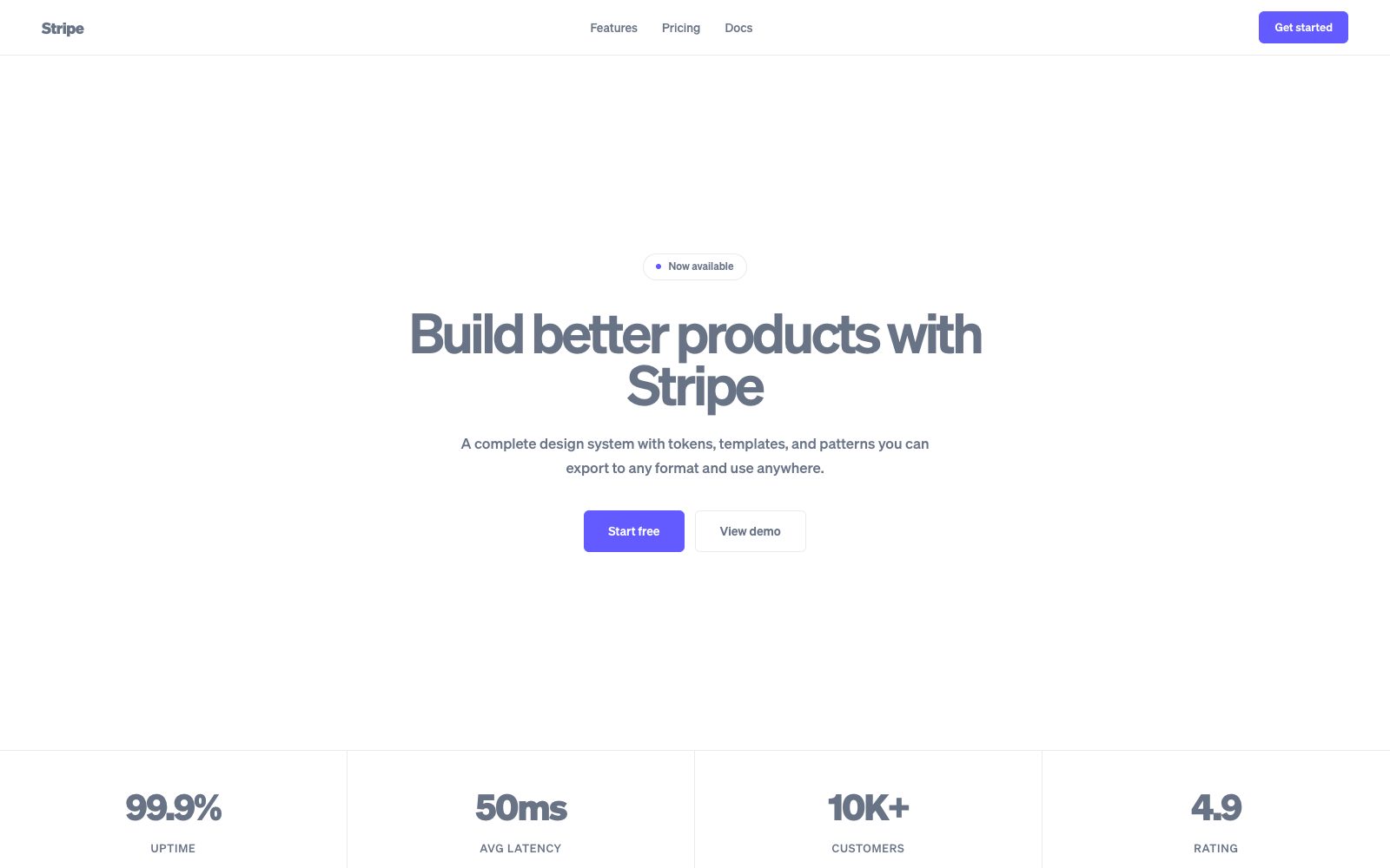
Polished, trustworthy, luminous gradients floating above a structured white grid.

Clean gradient cosmos with precise financial typography and a confident indigo spine.

## Color palette and roles
- **White (#ffffff)**: Page canvas and card surfaces.
- **Light Gray (#f6f9fc)**: Alternate section backgrounds, input fills.
- **Cool Gray (#697386)**: Secondary body text and metadata.
- **Dark Slate (#425466)**: Primary body text.
- **Midnight (#0a2540)**: Headings, hero text, nav foreground.
- **Blurple (#635bff)**: Primary CTA buttons, links, focus rings.
- **Cyan (#00d4ff)**: Gradient accent, data visualization highlights.
- **Green (#09825d)**: Success states, positive metrics.

## Typography rules
- **Display**: Söhne, 600, 64px. Hero headlines.
- **Body**: Söhne, 400, 17px. Paragraph copy.
- **Code**: Söhne Mono, 400, 14px. API references, code blocks.

## Spacing and shape
- Base unit: 8px.
- Default gap: 16px.
- Card padding: 32px.
- Section padding: 80px.
- Card corners: 12px.
- Control corners: 6px.
- Pills: 9999px.

## Motion
Use restrained motion. Fast feedback lasts 150ms; composed transitions last 400ms; easing is cubic-bezier(0.25, 0.1, 0.25, 1).

## Guardrails
- Use the indigo-to-cyan gradient exclusively for hero sections — never on cards.
- Keep body at 17px Söhne weight 400 with line-height 1.65.
- Set headings in dark Midnight (#0a2540) — never pure black.
- Limit the palette to 2 brand colors per view plus neutrals.
- Use subtle 1px borders and soft shadows for card elevation.
---
name: "Stripe"
mode: "light"
---

# Stripe

## Visual theme and atmosphere
Polished, trustworthy, luminous gradients floating above a structured white grid.

Clean gradient cosmos with precise financial typography and a confident indigo spine.

## Color palette and roles
- **White (#ffffff)**: Page canvas and card surfaces.
- **Light Gray (#f6f9fc)**: Alternate section backgrounds, input fills.
- **Cool Gray (#697386)**: Secondary body text and metadata.
- **Dark Slate (#425466)**: Primary body text.
- **Midnight (#0a2540)**: Headings, hero text, nav foreground.
- **Blurple (#635bff)**: Primary CTA buttons, links, focus rings.
- **Cyan (#00d4ff)**: Gradient accent, data visualization highlights.
- **Green (#09825d)**: Success states, positive metrics.

## Typography rules
- **Display**: Söhne, 600, 64px. Hero headlines.
- **Body**: Söhne, 400, 17px. Paragraph copy.
- **Code**: Söhne Mono, 400, 14px. API references, code blocks.

## Spacing and shape
- Base unit: 8px.
- Default gap: 16px.
- Card padding: 32px.
- Section padding: 80px.
- Card corners: 12px.
- Control corners: 6px.
- Pills: 9999px.

## Motion
Use restrained motion. Fast feedback lasts 150ms; composed transitions last 400ms; easing is cubic-bezier(0.25, 0.1, 0.25, 1).

## Guardrails
- Use the indigo-to-cyan gradient exclusively for hero sections — never on cards.
- Keep body at 17px Söhne weight 400 with line-height 1.65.
- Set headings in dark Midnight (#0a2540) — never pure black.
- Limit the palette to 2 brand colors per view plus neutrals.
- Use subtle 1px borders and soft shadows for card elevation.
---
name: "Stripe"
mode: "light"
---

# Stripe

## Visual theme and atmosphere
Polished, trustworthy, luminous gradients floating above a structured white grid.

Clean gradient cosmos with precise financial typography and a confident indigo spine.

## Color palette and roles
- **White (#ffffff)**: Page canvas and card surfaces.
- **Light Gray (#f6f9fc)**: Alternate section backgrounds, input fills.
- **Cool Gray (#697386)**: Secondary body text and metadata.
- **Dark Slate (#425466)**: Primary body text.
- **Midnight (#0a2540)**: Headings, hero text, nav foreground.
- **Blurple (#635bff)**: Primary CTA buttons, links, focus rings.
- **Cyan (#00d4ff)**: Gradient accent, data visualization highlights.
- **Green (#09825d)**: Success states, positive metrics.

## Typography rules
- **Display**: Söhne, 600, 64px. Hero headlines.
- **Body**: Söhne, 400, 17px. Paragraph copy.
- **Code**: Söhne Mono, 400, 14px. API references, code blocks.

## Spacing and shape
- Base unit: 8px.
- Default gap: 16px.
- Card padding: 32px.
- Section padding: 80px.
- Card corners: 12px.
- Control corners: 6px.
- Pills: 9999px.

## Motion
Use restrained motion. Fast feedback lasts 150ms; composed transitions last 400ms; easing is cubic-bezier(0.25, 0.1, 0.25, 1).

## Guardrails
- Use the indigo-to-cyan gradient exclusively for hero sections — never on cards.
- Keep body at 17px Söhne weight 400 with line-height 1.65.
- Set headings in dark Midnight (#0a2540) — never pure black.
- Limit the palette to 2 brand colors per view plus neutrals.
- Use subtle 1px borders and soft shadows for card elevation.
---
name: "Stripe"
mode: "light"
---

# Stripe

## Visual theme and atmosphere
Polished, trustworthy, luminous gradients floating above a structured white grid.

Clean gradient cosmos with precise financial typography and a confident indigo spine.

## Color palette and roles
- **White (#ffffff)**: Page canvas and card surfaces.
- **Light Gray (#f6f9fc)**: Alternate section backgrounds, input fills.
- **Cool Gray (#697386)**: Secondary body text and metadata.
- **Dark Slate (#425466)**: Primary body text.
- **Midnight (#0a2540)**: Headings, hero text, nav foreground.
- **Blurple (#635bff)**: Primary CTA buttons, links, focus rings.
- **Cyan (#00d4ff)**: Gradient accent, data visualization highlights.
- **Green (#09825d)**: Success states, positive metrics.

## Typography rules
- **Display**: Söhne, 600, 64px. Hero headlines.
- **Body**: Söhne, 400, 17px. Paragraph copy.
- **Code**: Söhne Mono, 400, 14px. API references, code blocks.

## Spacing and shape
- Base unit: 8px.
- Default gap: 16px.
- Card padding: 32px.
- Section padding: 80px.
- Card corners: 12px.
- Control corners: 6px.
- Pills: 9999px.

## Motion
Use restrained motion. Fast feedback lasts 150ms; composed transitions last 400ms; easing is cubic-bezier(0.25, 0.1, 0.25, 1).

## Guardrails
- Use the indigo-to-cyan gradient exclusively for hero sections — never on cards.
- Keep body at 17px Söhne weight 400 with line-height 1.65.
- Set headings in dark Midnight (#0a2540) — never pure black.
- Limit the palette to 2 brand colors per view plus neutrals.
- Use subtle 1px borders and soft shadows for card elevation.
---
name: "Stripe"
mode: "light"
---

# Stripe

## Visual theme and atmosphere
Polished, trustworthy, luminous gradients floating above a structured white grid.

Clean gradient cosmos with precise financial typography and a confident indigo spine.

## Color palette and roles
- **White (#ffffff)**: Page canvas and card surfaces.
- **Light Gray (#f6f9fc)**: Alternate section backgrounds, input fills.
- **Cool Gray (#697386)**: Secondary body text and metadata.
- **Dark Slate (#425466)**: Primary body text.
- **Midnight (#0a2540)**: Headings, hero text, nav foreground.
- **Blurple (#635bff)**: Primary CTA buttons, links, focus rings.
- **Cyan (#00d4ff)**: Gradient accent, data visualization highlights.
- **Green (#09825d)**: Success states, positive metrics.

## Typography rules
- **Display**: Söhne, 600, 64px. Hero headlines.
- **Body**: Söhne, 400, 17px. Paragraph copy.
- **Code**: Söhne Mono, 400, 14px. API references, code blocks.

## Spacing and shape
- Base unit: 8px.
- Default gap: 16px.
- Card padding: 32px.
- Section padding: 80px.
- Card corners: 12px.
- Control corners: 6px.
- Pills: 9999px.

## Motion
Use restrained motion. Fast feedback lasts 150ms; composed transitions last 400ms; easing is cubic-bezier(0.25, 0.1, 0.25, 1).

## Guardrails
- Use the indigo-to-cyan gradient exclusively for hero sections — never on cards.
- Keep body at 17px Söhne weight 400 with line-height 1.65.
- Set headings in dark Midnight (#0a2540) — never pure black.
- Limit the palette to 2 brand colors per view plus neutrals.
- Use subtle 1px borders and soft shadows for card elevation.