---
name: "Airtable"
mode: "light"
---

# Airtable

## Visual theme and atmosphere
Warm, editorial, opinionated, and humanly organized.

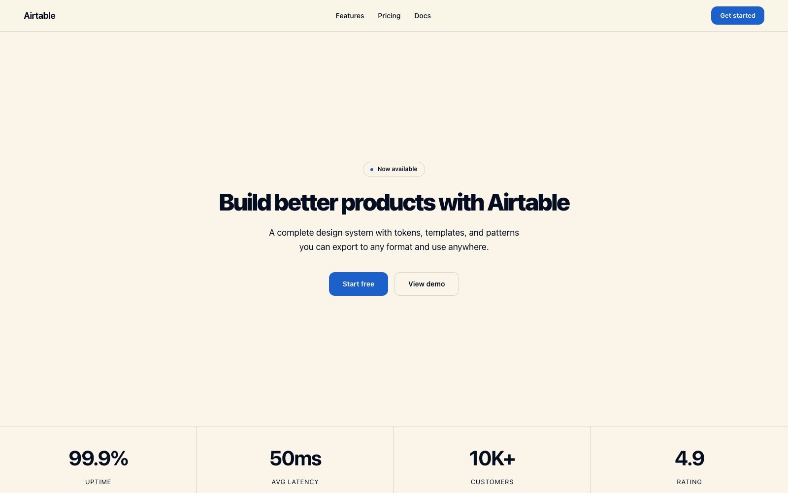
Warm workshop with color-coded chapters on parchment cream canvas.

## Color palette and roles
- **Parchment Cream (#faf5e8)**: Page canvas — warm off-white.
- **Pure White (#ffffff)**: Card surfaces and elevated panels.
- **Midnight Indigo (#040e20)**: Deepest heading text.
- **Cobalt Blue (#1b61c9)**: Blue accent for decorative details.
- **Terracotta (#aa2d00)**: Orange accent for feature cards.
- **Marigold (#fcb42a)**: Warm accent for badges and highlights.

## Typography rules
- **Display**: Haas Groot Disp, 900, 48px. Hero headlines and section titles.
- **Body**: Haas, 400, 18px. Body, nav, buttons, subheadings.
- **Label**: Haas, 600, 14px. Buttons and emphasis labels.

## Spacing and shape
- Base unit: 8px.
- Default gap: 16px.
- Card padding: 24px.
- Section padding: 64px.
- Card corners: 16px.
- Control corners: 12px.
- Pills: 32px.

## Motion
Use restrained motion. Fast feedback lasts 140ms; composed transitions last 320ms; easing is cubic-bezier(0.16, 1, 0.3, 1).

## Guardrails
- Use Parchment Cream as the base canvas — never pure white.
- Anchor interactive elements with Onyx (#181d26) not brand-colored fill.
- Apply 8px base unit: 8, 16, 24, 32, 40, 64.
- Do not use sharp corners — minimum 12px.
---
name: "Airtable"
mode: "light"
---

# Airtable

## Visual theme and atmosphere
Warm, editorial, opinionated, and humanly organized.

Warm workshop with color-coded chapters on parchment cream canvas.

## Color palette and roles
- **Parchment Cream (#faf5e8)**: Page canvas — warm off-white.
- **Pure White (#ffffff)**: Card surfaces and elevated panels.
- **Midnight Indigo (#040e20)**: Deepest heading text.
- **Cobalt Blue (#1b61c9)**: Blue accent for decorative details.
- **Terracotta (#aa2d00)**: Orange accent for feature cards.
- **Marigold (#fcb42a)**: Warm accent for badges and highlights.

## Typography rules
- **Display**: Haas Groot Disp, 900, 48px. Hero headlines and section titles.
- **Body**: Haas, 400, 18px. Body, nav, buttons, subheadings.
- **Label**: Haas, 600, 14px. Buttons and emphasis labels.

## Spacing and shape
- Base unit: 8px.
- Default gap: 16px.
- Card padding: 24px.
- Section padding: 64px.
- Card corners: 16px.
- Control corners: 12px.
- Pills: 32px.

## Motion
Use restrained motion. Fast feedback lasts 140ms; composed transitions last 320ms; easing is cubic-bezier(0.16, 1, 0.3, 1).

## Guardrails
- Use Parchment Cream as the base canvas — never pure white.
- Anchor interactive elements with Onyx (#181d26) not brand-colored fill.
- Apply 8px base unit: 8, 16, 24, 32, 40, 64.
- Do not use sharp corners — minimum 12px.
---
name: "Airtable"
mode: "light"
---

# Airtable

## Visual theme and atmosphere
Warm, editorial, opinionated, and humanly organized.

Warm workshop with color-coded chapters on parchment cream canvas.

## Color palette and roles
- **Parchment Cream (#faf5e8)**: Page canvas — warm off-white.
- **Pure White (#ffffff)**: Card surfaces and elevated panels.
- **Midnight Indigo (#040e20)**: Deepest heading text.
- **Cobalt Blue (#1b61c9)**: Blue accent for decorative details.
- **Terracotta (#aa2d00)**: Orange accent for feature cards.
- **Marigold (#fcb42a)**: Warm accent for badges and highlights.

## Typography rules
- **Display**: Haas Groot Disp, 900, 48px. Hero headlines and section titles.
- **Body**: Haas, 400, 18px. Body, nav, buttons, subheadings.
- **Label**: Haas, 600, 14px. Buttons and emphasis labels.

## Spacing and shape
- Base unit: 8px.
- Default gap: 16px.
- Card padding: 24px.
- Section padding: 64px.
- Card corners: 16px.
- Control corners: 12px.
- Pills: 32px.

## Motion
Use restrained motion. Fast feedback lasts 140ms; composed transitions last 320ms; easing is cubic-bezier(0.16, 1, 0.3, 1).

## Guardrails
- Use Parchment Cream as the base canvas — never pure white.
- Anchor interactive elements with Onyx (#181d26) not brand-colored fill.
- Apply 8px base unit: 8, 16, 24, 32, 40, 64.
- Do not use sharp corners — minimum 12px.
---
name: "Airtable"
mode: "light"
---

# Airtable

## Visual theme and atmosphere
Warm, editorial, opinionated, and humanly organized.

Warm workshop with color-coded chapters on parchment cream canvas.

## Color palette and roles
- **Parchment Cream (#faf5e8)**: Page canvas — warm off-white.
- **Pure White (#ffffff)**: Card surfaces and elevated panels.
- **Midnight Indigo (#040e20)**: Deepest heading text.
- **Cobalt Blue (#1b61c9)**: Blue accent for decorative details.
- **Terracotta (#aa2d00)**: Orange accent for feature cards.
- **Marigold (#fcb42a)**: Warm accent for badges and highlights.

## Typography rules
- **Display**: Haas Groot Disp, 900, 48px. Hero headlines and section titles.
- **Body**: Haas, 400, 18px. Body, nav, buttons, subheadings.
- **Label**: Haas, 600, 14px. Buttons and emphasis labels.

## Spacing and shape
- Base unit: 8px.
- Default gap: 16px.
- Card padding: 24px.
- Section padding: 64px.
- Card corners: 16px.
- Control corners: 12px.
- Pills: 32px.

## Motion
Use restrained motion. Fast feedback lasts 140ms; composed transitions last 320ms; easing is cubic-bezier(0.16, 1, 0.3, 1).

## Guardrails
- Use Parchment Cream as the base canvas — never pure white.
- Anchor interactive elements with Onyx (#181d26) not brand-colored fill.
- Apply 8px base unit: 8, 16, 24, 32, 40, 64.
- Do not use sharp corners — minimum 12px.
---
name: "Airtable"
mode: "light"
---

# Airtable

## Visual theme and atmosphere
Warm, editorial, opinionated, and humanly organized.

Warm workshop with color-coded chapters on parchment cream canvas.

## Color palette and roles
- **Parchment Cream (#faf5e8)**: Page canvas — warm off-white.
- **Pure White (#ffffff)**: Card surfaces and elevated panels.
- **Midnight Indigo (#040e20)**: Deepest heading text.
- **Cobalt Blue (#1b61c9)**: Blue accent for decorative details.
- **Terracotta (#aa2d00)**: Orange accent for feature cards.
- **Marigold (#fcb42a)**: Warm accent for badges and highlights.

## Typography rules
- **Display**: Haas Groot Disp, 900, 48px. Hero headlines and section titles.
- **Body**: Haas, 400, 18px. Body, nav, buttons, subheadings.
- **Label**: Haas, 600, 14px. Buttons and emphasis labels.

## Spacing and shape
- Base unit: 8px.
- Default gap: 16px.
- Card padding: 24px.
- Section padding: 64px.
- Card corners: 16px.
- Control corners: 12px.
- Pills: 32px.

## Motion
Use restrained motion. Fast feedback lasts 140ms; composed transitions last 320ms; easing is cubic-bezier(0.16, 1, 0.3, 1).

## Guardrails
- Use Parchment Cream as the base canvas — never pure white.
- Anchor interactive elements with Onyx (#181d26) not brand-colored fill.
- Apply 8px base unit: 8, 16, 24, 32, 40, 64.
- Do not use sharp corners — minimum 12px.