---
name: "Figma"
mode: "light"
---

# Figma

## Visual theme and atmosphere
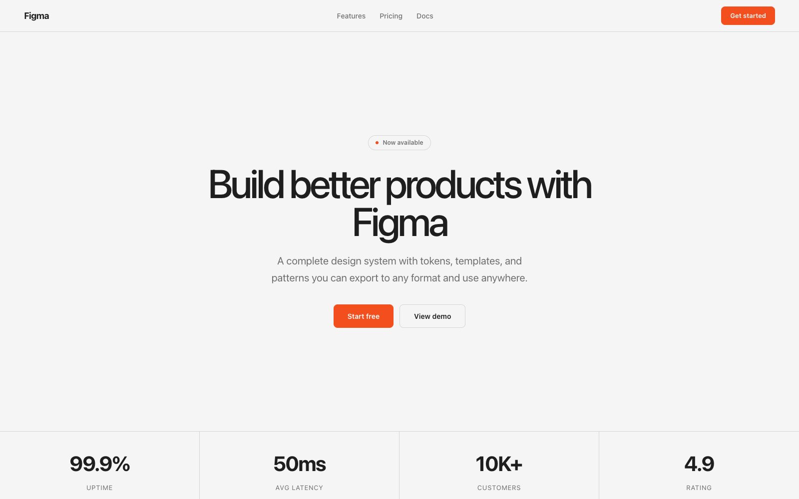
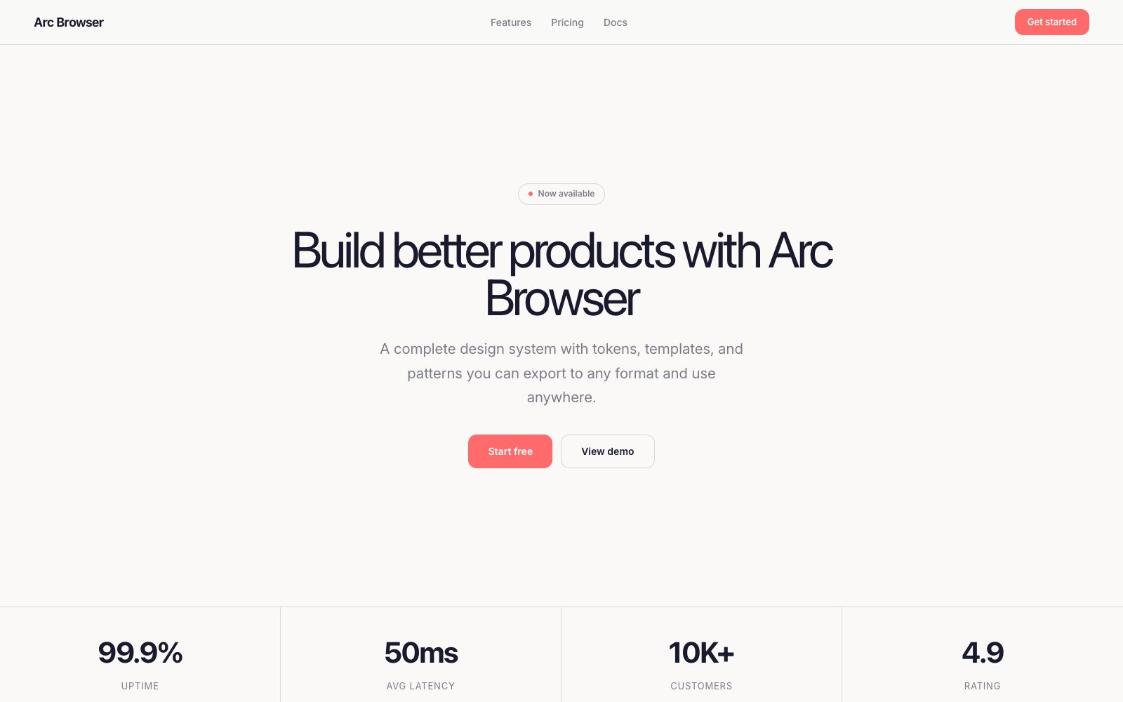
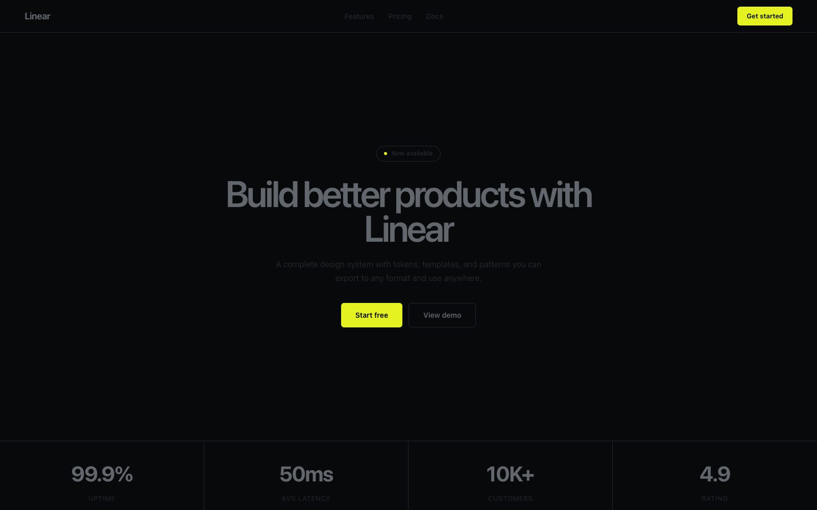
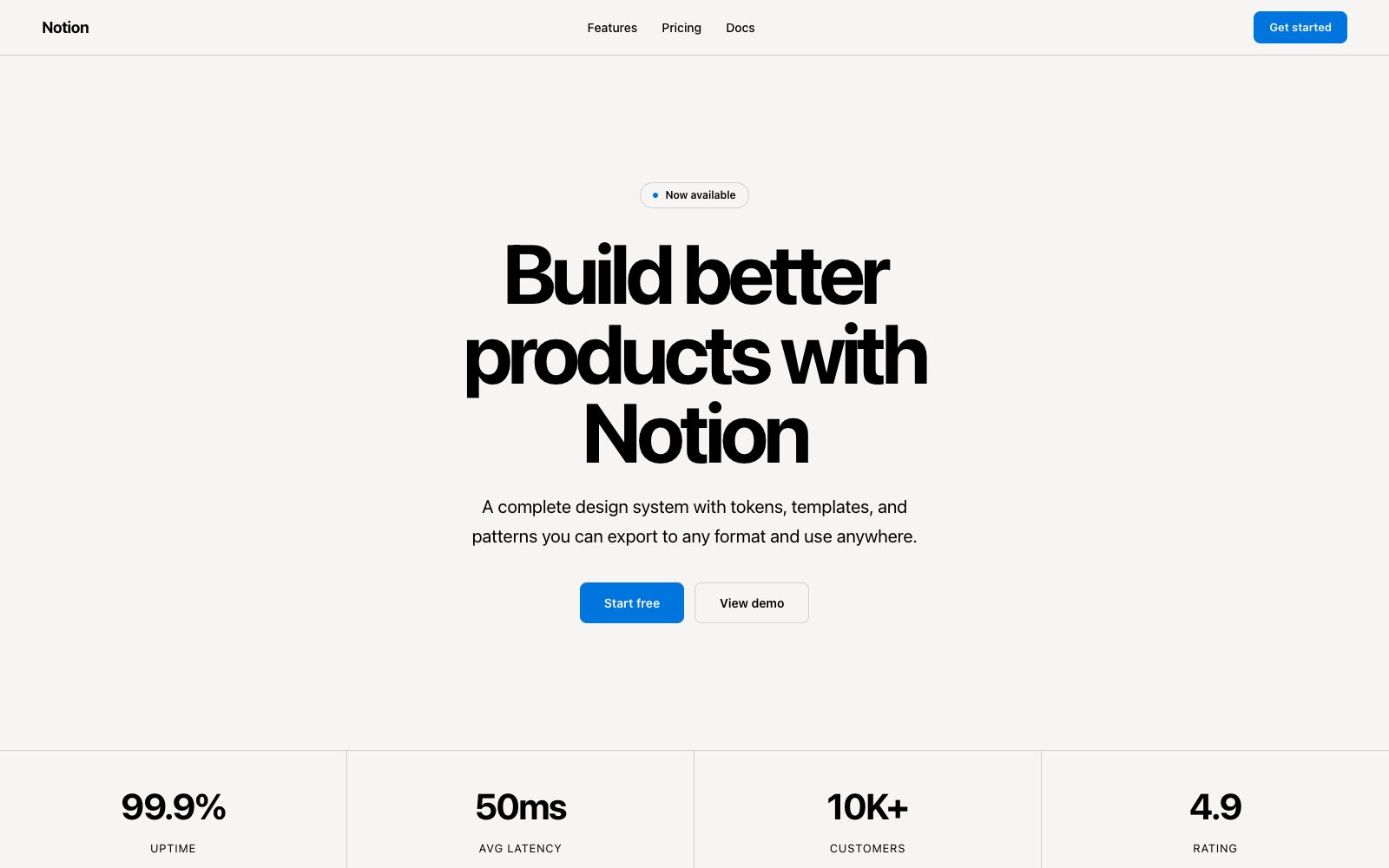
Approachable, playful, collaborative — bright primaries on clean off-white.

A warm neutral canvas with a vibrant multi-color icon language and friendly geometry.

## Color palette and roles
- **Canvas (#f5f5f5)**: Page and editor background.
- **White (#ffffff)**: Card surfaces, panels, dialogs.
- **Text Primary (#1e1e1e)**: Headings and primary body.
- **Text Secondary (#6e6e6e)**: Captions and metadata.
- **Red (#f24e1e)**: Figma brand mark, error states.
- **Orange (#ff7262)**: Secondary brand, hover emphasis.
- **Purple (#a259ff)**: Plugins, community features.
- **Green (#0acf83)**: FigJam, success, collaboration.
- **Blue (#1abcfe)**: Dev mode, selection highlights.

## Typography rules
- **Display**: Whyte, 500, 80px. Marketing hero headlines.
- **Body**: Inter, 400, 16px. Documentation and interface text.
- **Code**: Source Code Pro, 400, 14px. Dev mode, API references.

## Spacing and shape
- Base unit: 8px.
- Default gap: 16px.
- Card padding: 24px.
- Section padding: 96px.
- Card corners: 12px.
- Control corners: 8px.
- Pills: 9999px.

## Motion
Use restrained motion. Fast feedback lasts 120ms; composed transitions last 300ms; easing is cubic-bezier(0.2, 0, 0, 1).

## Guardrails
- Use multi-color primaries together in icon and illustration contexts only.
- Keep UI text in Inter — reserve Whyte for marketing headlines.
- Never apply brand colors as full-bleed backgrounds — they stay small.
- Use generous 96px section padding for marketing layouts.
- Keep card radius at 12px and control radius at 8px consistently.
---
name: "Figma"
mode: "light"
---

# Figma

## Visual theme and atmosphere
Approachable, playful, collaborative — bright primaries on clean off-white.

A warm neutral canvas with a vibrant multi-color icon language and friendly geometry.

## Color palette and roles
- **Canvas (#f5f5f5)**: Page and editor background.
- **White (#ffffff)**: Card surfaces, panels, dialogs.
- **Text Primary (#1e1e1e)**: Headings and primary body.
- **Text Secondary (#6e6e6e)**: Captions and metadata.
- **Red (#f24e1e)**: Figma brand mark, error states.
- **Orange (#ff7262)**: Secondary brand, hover emphasis.
- **Purple (#a259ff)**: Plugins, community features.
- **Green (#0acf83)**: FigJam, success, collaboration.
- **Blue (#1abcfe)**: Dev mode, selection highlights.

## Typography rules
- **Display**: Whyte, 500, 80px. Marketing hero headlines.
- **Body**: Inter, 400, 16px. Documentation and interface text.
- **Code**: Source Code Pro, 400, 14px. Dev mode, API references.

## Spacing and shape
- Base unit: 8px.
- Default gap: 16px.
- Card padding: 24px.
- Section padding: 96px.
- Card corners: 12px.
- Control corners: 8px.
- Pills: 9999px.

## Motion
Use restrained motion. Fast feedback lasts 120ms; composed transitions last 300ms; easing is cubic-bezier(0.2, 0, 0, 1).

## Guardrails
- Use multi-color primaries together in icon and illustration contexts only.
- Keep UI text in Inter — reserve Whyte for marketing headlines.
- Never apply brand colors as full-bleed backgrounds — they stay small.
- Use generous 96px section padding for marketing layouts.
- Keep card radius at 12px and control radius at 8px consistently.
---
name: "Figma"
mode: "light"
---

# Figma

## Visual theme and atmosphere
Approachable, playful, collaborative — bright primaries on clean off-white.

A warm neutral canvas with a vibrant multi-color icon language and friendly geometry.

## Color palette and roles
- **Canvas (#f5f5f5)**: Page and editor background.
- **White (#ffffff)**: Card surfaces, panels, dialogs.
- **Text Primary (#1e1e1e)**: Headings and primary body.
- **Text Secondary (#6e6e6e)**: Captions and metadata.
- **Red (#f24e1e)**: Figma brand mark, error states.
- **Orange (#ff7262)**: Secondary brand, hover emphasis.
- **Purple (#a259ff)**: Plugins, community features.
- **Green (#0acf83)**: FigJam, success, collaboration.
- **Blue (#1abcfe)**: Dev mode, selection highlights.

## Typography rules
- **Display**: Whyte, 500, 80px. Marketing hero headlines.
- **Body**: Inter, 400, 16px. Documentation and interface text.
- **Code**: Source Code Pro, 400, 14px. Dev mode, API references.

## Spacing and shape
- Base unit: 8px.
- Default gap: 16px.
- Card padding: 24px.
- Section padding: 96px.
- Card corners: 12px.
- Control corners: 8px.
- Pills: 9999px.

## Motion
Use restrained motion. Fast feedback lasts 120ms; composed transitions last 300ms; easing is cubic-bezier(0.2, 0, 0, 1).

## Guardrails
- Use multi-color primaries together in icon and illustration contexts only.
- Keep UI text in Inter — reserve Whyte for marketing headlines.
- Never apply brand colors as full-bleed backgrounds — they stay small.
- Use generous 96px section padding for marketing layouts.
- Keep card radius at 12px and control radius at 8px consistently.
---
name: "Figma"
mode: "light"
---

# Figma

## Visual theme and atmosphere
Approachable, playful, collaborative — bright primaries on clean off-white.

A warm neutral canvas with a vibrant multi-color icon language and friendly geometry.

## Color palette and roles
- **Canvas (#f5f5f5)**: Page and editor background.
- **White (#ffffff)**: Card surfaces, panels, dialogs.
- **Text Primary (#1e1e1e)**: Headings and primary body.
- **Text Secondary (#6e6e6e)**: Captions and metadata.
- **Red (#f24e1e)**: Figma brand mark, error states.
- **Orange (#ff7262)**: Secondary brand, hover emphasis.
- **Purple (#a259ff)**: Plugins, community features.
- **Green (#0acf83)**: FigJam, success, collaboration.
- **Blue (#1abcfe)**: Dev mode, selection highlights.

## Typography rules
- **Display**: Whyte, 500, 80px. Marketing hero headlines.
- **Body**: Inter, 400, 16px. Documentation and interface text.
- **Code**: Source Code Pro, 400, 14px. Dev mode, API references.

## Spacing and shape
- Base unit: 8px.
- Default gap: 16px.
- Card padding: 24px.
- Section padding: 96px.
- Card corners: 12px.
- Control corners: 8px.
- Pills: 9999px.

## Motion
Use restrained motion. Fast feedback lasts 120ms; composed transitions last 300ms; easing is cubic-bezier(0.2, 0, 0, 1).

## Guardrails
- Use multi-color primaries together in icon and illustration contexts only.
- Keep UI text in Inter — reserve Whyte for marketing headlines.
- Never apply brand colors as full-bleed backgrounds — they stay small.
- Use generous 96px section padding for marketing layouts.
- Keep card radius at 12px and control radius at 8px consistently.
---
name: "Figma"
mode: "light"
---

# Figma

## Visual theme and atmosphere
Approachable, playful, collaborative — bright primaries on clean off-white.

A warm neutral canvas with a vibrant multi-color icon language and friendly geometry.

## Color palette and roles
- **Canvas (#f5f5f5)**: Page and editor background.
- **White (#ffffff)**: Card surfaces, panels, dialogs.
- **Text Primary (#1e1e1e)**: Headings and primary body.
- **Text Secondary (#6e6e6e)**: Captions and metadata.
- **Red (#f24e1e)**: Figma brand mark, error states.
- **Orange (#ff7262)**: Secondary brand, hover emphasis.
- **Purple (#a259ff)**: Plugins, community features.
- **Green (#0acf83)**: FigJam, success, collaboration.
- **Blue (#1abcfe)**: Dev mode, selection highlights.

## Typography rules
- **Display**: Whyte, 500, 80px. Marketing hero headlines.
- **Body**: Inter, 400, 16px. Documentation and interface text.
- **Code**: Source Code Pro, 400, 14px. Dev mode, API references.

## Spacing and shape
- Base unit: 8px.
- Default gap: 16px.
- Card padding: 24px.
- Section padding: 96px.
- Card corners: 12px.
- Control corners: 8px.
- Pills: 9999px.

## Motion
Use restrained motion. Fast feedback lasts 120ms; composed transitions last 300ms; easing is cubic-bezier(0.2, 0, 0, 1).

## Guardrails
- Use multi-color primaries together in icon and illustration contexts only.
- Keep UI text in Inter — reserve Whyte for marketing headlines.
- Never apply brand colors as full-bleed backgrounds — they stay small.
- Use generous 96px section padding for marketing layouts.
- Keep card radius at 12px and control radius at 8px consistently.