---
name: "Arc Browser"
mode: "adaptive"
---

# Arc Browser

## Visual theme and atmosphere
Whimsical, personal, joyful — user-chosen gradients over soft rounded architecture.

A playful gradient wonderland with rounded geometry and vibrant theming per-space.

## Color palette and roles
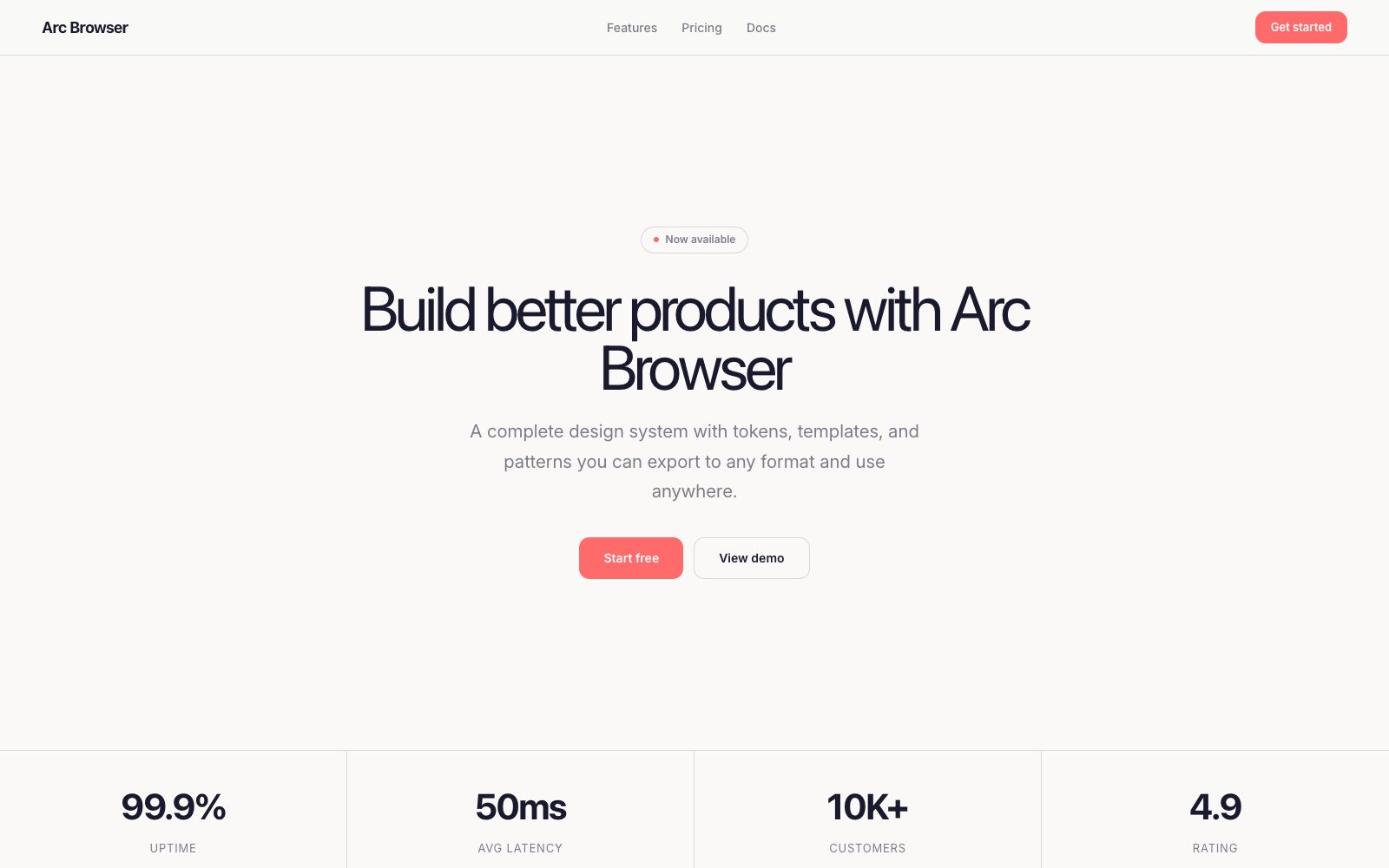
- **Canvas (#faf9f7)**: Marketing page background.
- **White (#ffffff)**: Card surfaces, modal backgrounds.
- **Text (#1a1a2e)**: Primary headings and body.
- **Muted (#7c7c8a)**: Secondary text, captions.
- **Coral (#ff6b6b)**: Featured space accent, CTA.
- **Lavender (#c084fc)**: Space theme, gradient start.
- **Sky (#60a5fa)**: Space theme, gradient middle.
- **Mint (#34d399)**: Space theme, gradient end.

## Typography rules
- **Display**: Instrument Serif, 400, 72px. Hero headlines with italic flair.
- **Body**: Inter, 400, 18px. Marketing copy and descriptions.
- **UI**: Inter, 500, 13px. Browser UI and controls.

## Spacing and shape
- Base unit: 8px.
- Default gap: 20px.
- Card padding: 32px.
- Section padding: 96px.
- Card corners: 20px.
- Control corners: 12px.
- Pills: 9999px.

## Motion
Use expressive motion. Fast feedback lasts 120ms; composed transitions last 500ms; easing is cubic-bezier(0.34, 1.56, 0.64, 1).

## Guardrails
- Use Instrument Serif for hero headlines — never for body copy or UI.
- Gradients are personal — let users choose their own space colors.
- Apply large 20px card radius for Arc's signature softness.
- Use spring-based easing for interactions — the interface should bounce.
- Keep marketing body at 18px with generous line-height 1.7.
---
name: "Arc Browser"
mode: "adaptive"
---

# Arc Browser

## Visual theme and atmosphere
Whimsical, personal, joyful — user-chosen gradients over soft rounded architecture.

A playful gradient wonderland with rounded geometry and vibrant theming per-space.

## Color palette and roles
- **Canvas (#faf9f7)**: Marketing page background.
- **White (#ffffff)**: Card surfaces, modal backgrounds.
- **Text (#1a1a2e)**: Primary headings and body.
- **Muted (#7c7c8a)**: Secondary text, captions.
- **Coral (#ff6b6b)**: Featured space accent, CTA.
- **Lavender (#c084fc)**: Space theme, gradient start.
- **Sky (#60a5fa)**: Space theme, gradient middle.
- **Mint (#34d399)**: Space theme, gradient end.

## Typography rules
- **Display**: Instrument Serif, 400, 72px. Hero headlines with italic flair.
- **Body**: Inter, 400, 18px. Marketing copy and descriptions.
- **UI**: Inter, 500, 13px. Browser UI and controls.

## Spacing and shape
- Base unit: 8px.
- Default gap: 20px.
- Card padding: 32px.
- Section padding: 96px.
- Card corners: 20px.
- Control corners: 12px.
- Pills: 9999px.

## Motion
Use expressive motion. Fast feedback lasts 120ms; composed transitions last 500ms; easing is cubic-bezier(0.34, 1.56, 0.64, 1).

## Guardrails
- Use Instrument Serif for hero headlines — never for body copy or UI.
- Gradients are personal — let users choose their own space colors.
- Apply large 20px card radius for Arc's signature softness.
- Use spring-based easing for interactions — the interface should bounce.
- Keep marketing body at 18px with generous line-height 1.7.
---
name: "Arc Browser"
mode: "adaptive"
---

# Arc Browser

## Visual theme and atmosphere
Whimsical, personal, joyful — user-chosen gradients over soft rounded architecture.

A playful gradient wonderland with rounded geometry and vibrant theming per-space.

## Color palette and roles
- **Canvas (#faf9f7)**: Marketing page background.
- **White (#ffffff)**: Card surfaces, modal backgrounds.
- **Text (#1a1a2e)**: Primary headings and body.
- **Muted (#7c7c8a)**: Secondary text, captions.
- **Coral (#ff6b6b)**: Featured space accent, CTA.
- **Lavender (#c084fc)**: Space theme, gradient start.
- **Sky (#60a5fa)**: Space theme, gradient middle.
- **Mint (#34d399)**: Space theme, gradient end.

## Typography rules
- **Display**: Instrument Serif, 400, 72px. Hero headlines with italic flair.
- **Body**: Inter, 400, 18px. Marketing copy and descriptions.
- **UI**: Inter, 500, 13px. Browser UI and controls.

## Spacing and shape
- Base unit: 8px.
- Default gap: 20px.
- Card padding: 32px.
- Section padding: 96px.
- Card corners: 20px.
- Control corners: 12px.
- Pills: 9999px.

## Motion
Use expressive motion. Fast feedback lasts 120ms; composed transitions last 500ms; easing is cubic-bezier(0.34, 1.56, 0.64, 1).

## Guardrails
- Use Instrument Serif for hero headlines — never for body copy or UI.
- Gradients are personal — let users choose their own space colors.
- Apply large 20px card radius for Arc's signature softness.
- Use spring-based easing for interactions — the interface should bounce.
- Keep marketing body at 18px with generous line-height 1.7.
---
name: "Arc Browser"
mode: "adaptive"
---

# Arc Browser

## Visual theme and atmosphere
Whimsical, personal, joyful — user-chosen gradients over soft rounded architecture.

A playful gradient wonderland with rounded geometry and vibrant theming per-space.

## Color palette and roles
- **Canvas (#faf9f7)**: Marketing page background.
- **White (#ffffff)**: Card surfaces, modal backgrounds.
- **Text (#1a1a2e)**: Primary headings and body.
- **Muted (#7c7c8a)**: Secondary text, captions.
- **Coral (#ff6b6b)**: Featured space accent, CTA.
- **Lavender (#c084fc)**: Space theme, gradient start.
- **Sky (#60a5fa)**: Space theme, gradient middle.
- **Mint (#34d399)**: Space theme, gradient end.

## Typography rules
- **Display**: Instrument Serif, 400, 72px. Hero headlines with italic flair.
- **Body**: Inter, 400, 18px. Marketing copy and descriptions.
- **UI**: Inter, 500, 13px. Browser UI and controls.

## Spacing and shape
- Base unit: 8px.
- Default gap: 20px.
- Card padding: 32px.
- Section padding: 96px.
- Card corners: 20px.
- Control corners: 12px.
- Pills: 9999px.

## Motion
Use expressive motion. Fast feedback lasts 120ms; composed transitions last 500ms; easing is cubic-bezier(0.34, 1.56, 0.64, 1).

## Guardrails
- Use Instrument Serif for hero headlines — never for body copy or UI.
- Gradients are personal — let users choose their own space colors.
- Apply large 20px card radius for Arc's signature softness.
- Use spring-based easing for interactions — the interface should bounce.
- Keep marketing body at 18px with generous line-height 1.7.
---
name: "Arc Browser"
mode: "adaptive"
---

# Arc Browser

## Visual theme and atmosphere
Whimsical, personal, joyful — user-chosen gradients over soft rounded architecture.

A playful gradient wonderland with rounded geometry and vibrant theming per-space.

## Color palette and roles
- **Canvas (#faf9f7)**: Marketing page background.
- **White (#ffffff)**: Card surfaces, modal backgrounds.
- **Text (#1a1a2e)**: Primary headings and body.
- **Muted (#7c7c8a)**: Secondary text, captions.
- **Coral (#ff6b6b)**: Featured space accent, CTA.
- **Lavender (#c084fc)**: Space theme, gradient start.
- **Sky (#60a5fa)**: Space theme, gradient middle.
- **Mint (#34d399)**: Space theme, gradient end.

## Typography rules
- **Display**: Instrument Serif, 400, 72px. Hero headlines with italic flair.
- **Body**: Inter, 400, 18px. Marketing copy and descriptions.
- **UI**: Inter, 500, 13px. Browser UI and controls.

## Spacing and shape
- Base unit: 8px.
- Default gap: 20px.
- Card padding: 32px.
- Section padding: 96px.
- Card corners: 20px.
- Control corners: 12px.
- Pills: 9999px.

## Motion
Use expressive motion. Fast feedback lasts 120ms; composed transitions last 500ms; easing is cubic-bezier(0.34, 1.56, 0.64, 1).

## Guardrails
- Use Instrument Serif for hero headlines — never for body copy or UI.
- Gradients are personal — let users choose their own space colors.
- Apply large 20px card radius for Arc's signature softness.
- Use spring-based easing for interactions — the interface should bounce.
- Keep marketing body at 18px with generous line-height 1.7.