---
name: "Spotify"
mode: "dark"
---

# Spotify

## Visual theme and atmosphere
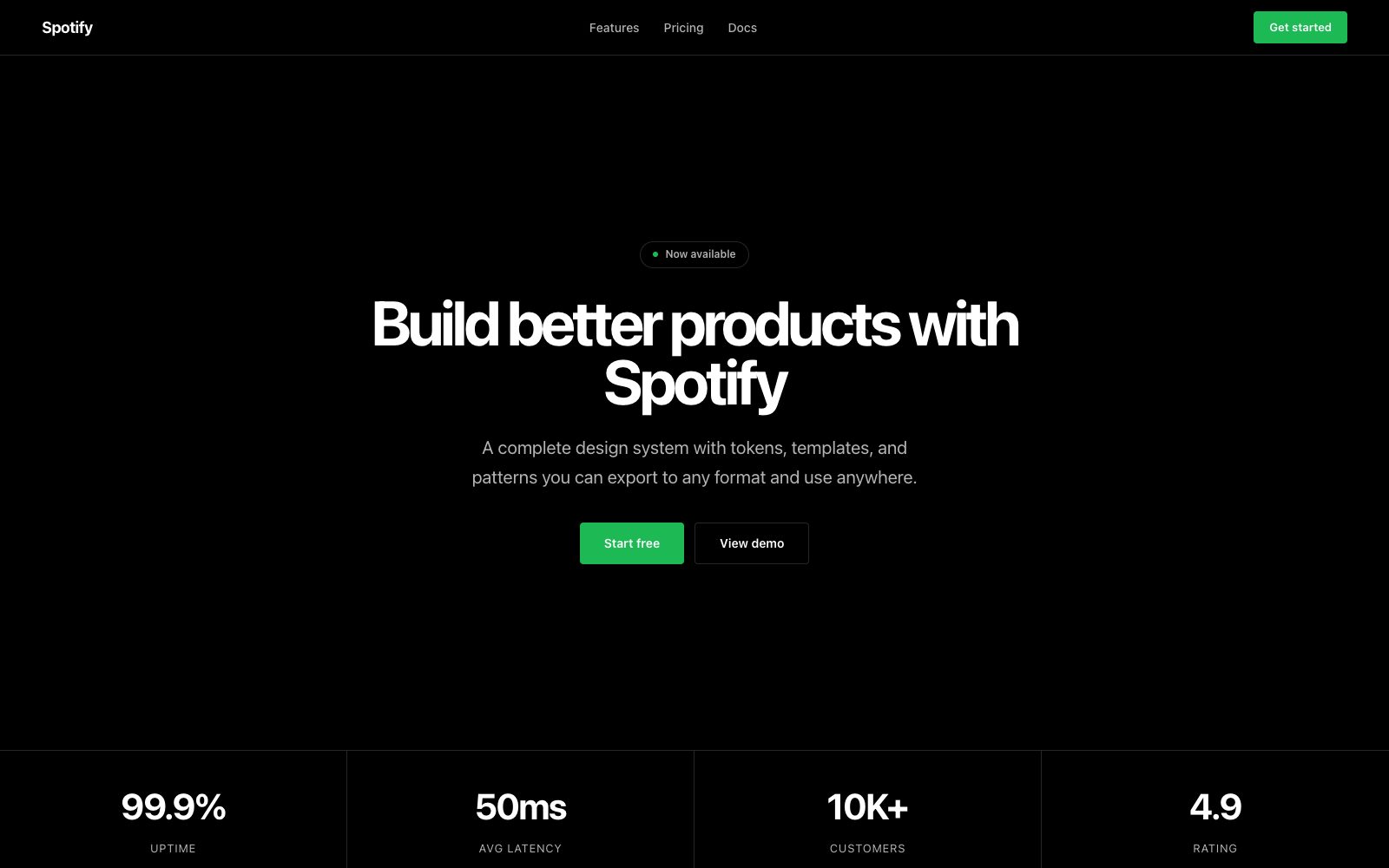
Full-bleed dark canvas that disappears behind media, punctuated by electric green.

Pure black immersion with vivid album art and signature neon green actions.

## Color palette and roles
- **Black (#000000)**: App background, immersive canvas.
- **Dark Gray (#121212)**: Card surfaces, nav background.
- **Elevated (#1a1a1a)**: Hover states, highlighted surfaces.
- **Surface (#282828)**: Active card, selected row.
- **Subdued (#b3b3b3)**: Secondary text, inactive icons.
- **White (#ffffff)**: Primary text, active controls.
- **Spotify Green (#1db954)**: Shuffle, play, primary CTA.
- **Error Red (#e91429)**: Explicit badges, error states.

## Typography rules
- **Display**: Spotify Mix, 700, 72px. Wrapped campaign headlines.
- **Body**: Spotify Mix, 400, 14px. Track lists and metadata.
- **Overline**: Spotify Mix, 700, 11px. Labels, section headers.

## Spacing and shape
- Base unit: 8px.
- Default gap: 16px.
- Card padding: 16px.
- Section padding: 48px.
- Card corners: 8px.
- Control corners: 4px.
- Pills: 500px.

## Motion
Use expressive motion. Fast feedback lasts 100ms; composed transitions last 350ms; easing is cubic-bezier(0.3, 0, 0, 1).

## Guardrails
- Use Spotify Green only for primary actions — never for text or backgrounds.
- Keep the canvas pure #000000 — never dark-gray or off-black.
- Album art is the color source — derive gradients from cover artwork.
- Set track metadata at 14px weight 400 with tight vertical rhythm.
- Use #b3b3b3 for all secondary and inactive text — never light gray.
---
name: "Spotify"
mode: "dark"
---

# Spotify

## Visual theme and atmosphere
Full-bleed dark canvas that disappears behind media, punctuated by electric green.

Pure black immersion with vivid album art and signature neon green actions.

## Color palette and roles
- **Black (#000000)**: App background, immersive canvas.
- **Dark Gray (#121212)**: Card surfaces, nav background.
- **Elevated (#1a1a1a)**: Hover states, highlighted surfaces.
- **Surface (#282828)**: Active card, selected row.
- **Subdued (#b3b3b3)**: Secondary text, inactive icons.
- **White (#ffffff)**: Primary text, active controls.
- **Spotify Green (#1db954)**: Shuffle, play, primary CTA.
- **Error Red (#e91429)**: Explicit badges, error states.

## Typography rules
- **Display**: Spotify Mix, 700, 72px. Wrapped campaign headlines.
- **Body**: Spotify Mix, 400, 14px. Track lists and metadata.
- **Overline**: Spotify Mix, 700, 11px. Labels, section headers.

## Spacing and shape
- Base unit: 8px.
- Default gap: 16px.
- Card padding: 16px.
- Section padding: 48px.
- Card corners: 8px.
- Control corners: 4px.
- Pills: 500px.

## Motion
Use expressive motion. Fast feedback lasts 100ms; composed transitions last 350ms; easing is cubic-bezier(0.3, 0, 0, 1).

## Guardrails
- Use Spotify Green only for primary actions — never for text or backgrounds.
- Keep the canvas pure #000000 — never dark-gray or off-black.
- Album art is the color source — derive gradients from cover artwork.
- Set track metadata at 14px weight 400 with tight vertical rhythm.
- Use #b3b3b3 for all secondary and inactive text — never light gray.
---
name: "Spotify"
mode: "dark"
---

# Spotify

## Visual theme and atmosphere
Full-bleed dark canvas that disappears behind media, punctuated by electric green.

Pure black immersion with vivid album art and signature neon green actions.

## Color palette and roles
- **Black (#000000)**: App background, immersive canvas.
- **Dark Gray (#121212)**: Card surfaces, nav background.
- **Elevated (#1a1a1a)**: Hover states, highlighted surfaces.
- **Surface (#282828)**: Active card, selected row.
- **Subdued (#b3b3b3)**: Secondary text, inactive icons.
- **White (#ffffff)**: Primary text, active controls.
- **Spotify Green (#1db954)**: Shuffle, play, primary CTA.
- **Error Red (#e91429)**: Explicit badges, error states.

## Typography rules
- **Display**: Spotify Mix, 700, 72px. Wrapped campaign headlines.
- **Body**: Spotify Mix, 400, 14px. Track lists and metadata.
- **Overline**: Spotify Mix, 700, 11px. Labels, section headers.

## Spacing and shape
- Base unit: 8px.
- Default gap: 16px.
- Card padding: 16px.
- Section padding: 48px.
- Card corners: 8px.
- Control corners: 4px.
- Pills: 500px.

## Motion
Use expressive motion. Fast feedback lasts 100ms; composed transitions last 350ms; easing is cubic-bezier(0.3, 0, 0, 1).

## Guardrails
- Use Spotify Green only for primary actions — never for text or backgrounds.
- Keep the canvas pure #000000 — never dark-gray or off-black.
- Album art is the color source — derive gradients from cover artwork.
- Set track metadata at 14px weight 400 with tight vertical rhythm.
- Use #b3b3b3 for all secondary and inactive text — never light gray.
---
name: "Spotify"
mode: "dark"
---

# Spotify

## Visual theme and atmosphere
Full-bleed dark canvas that disappears behind media, punctuated by electric green.

Pure black immersion with vivid album art and signature neon green actions.

## Color palette and roles
- **Black (#000000)**: App background, immersive canvas.
- **Dark Gray (#121212)**: Card surfaces, nav background.
- **Elevated (#1a1a1a)**: Hover states, highlighted surfaces.
- **Surface (#282828)**: Active card, selected row.
- **Subdued (#b3b3b3)**: Secondary text, inactive icons.
- **White (#ffffff)**: Primary text, active controls.
- **Spotify Green (#1db954)**: Shuffle, play, primary CTA.
- **Error Red (#e91429)**: Explicit badges, error states.

## Typography rules
- **Display**: Spotify Mix, 700, 72px. Wrapped campaign headlines.
- **Body**: Spotify Mix, 400, 14px. Track lists and metadata.
- **Overline**: Spotify Mix, 700, 11px. Labels, section headers.

## Spacing and shape
- Base unit: 8px.
- Default gap: 16px.
- Card padding: 16px.
- Section padding: 48px.
- Card corners: 8px.
- Control corners: 4px.
- Pills: 500px.

## Motion
Use expressive motion. Fast feedback lasts 100ms; composed transitions last 350ms; easing is cubic-bezier(0.3, 0, 0, 1).

## Guardrails
- Use Spotify Green only for primary actions — never for text or backgrounds.
- Keep the canvas pure #000000 — never dark-gray or off-black.
- Album art is the color source — derive gradients from cover artwork.
- Set track metadata at 14px weight 400 with tight vertical rhythm.
- Use #b3b3b3 for all secondary and inactive text — never light gray.
---
name: "Spotify"
mode: "dark"
---

# Spotify

## Visual theme and atmosphere
Full-bleed dark canvas that disappears behind media, punctuated by electric green.

Pure black immersion with vivid album art and signature neon green actions.

## Color palette and roles
- **Black (#000000)**: App background, immersive canvas.
- **Dark Gray (#121212)**: Card surfaces, nav background.
- **Elevated (#1a1a1a)**: Hover states, highlighted surfaces.
- **Surface (#282828)**: Active card, selected row.
- **Subdued (#b3b3b3)**: Secondary text, inactive icons.
- **White (#ffffff)**: Primary text, active controls.
- **Spotify Green (#1db954)**: Shuffle, play, primary CTA.
- **Error Red (#e91429)**: Explicit badges, error states.

## Typography rules
- **Display**: Spotify Mix, 700, 72px. Wrapped campaign headlines.
- **Body**: Spotify Mix, 400, 14px. Track lists and metadata.
- **Overline**: Spotify Mix, 700, 11px. Labels, section headers.

## Spacing and shape
- Base unit: 8px.
- Default gap: 16px.
- Card padding: 16px.
- Section padding: 48px.
- Card corners: 8px.
- Control corners: 4px.
- Pills: 500px.

## Motion
Use expressive motion. Fast feedback lasts 100ms; composed transitions last 350ms; easing is cubic-bezier(0.3, 0, 0, 1).

## Guardrails
- Use Spotify Green only for primary actions — never for text or backgrounds.
- Keep the canvas pure #000000 — never dark-gray or off-black.
- Album art is the color source — derive gradients from cover artwork.
- Set track metadata at 14px weight 400 with tight vertical rhythm.
- Use #b3b3b3 for all secondary and inactive text — never light gray.