---
name: "GitHub"
mode: "adaptive"
---

# GitHub

## Visual theme and atmosphere
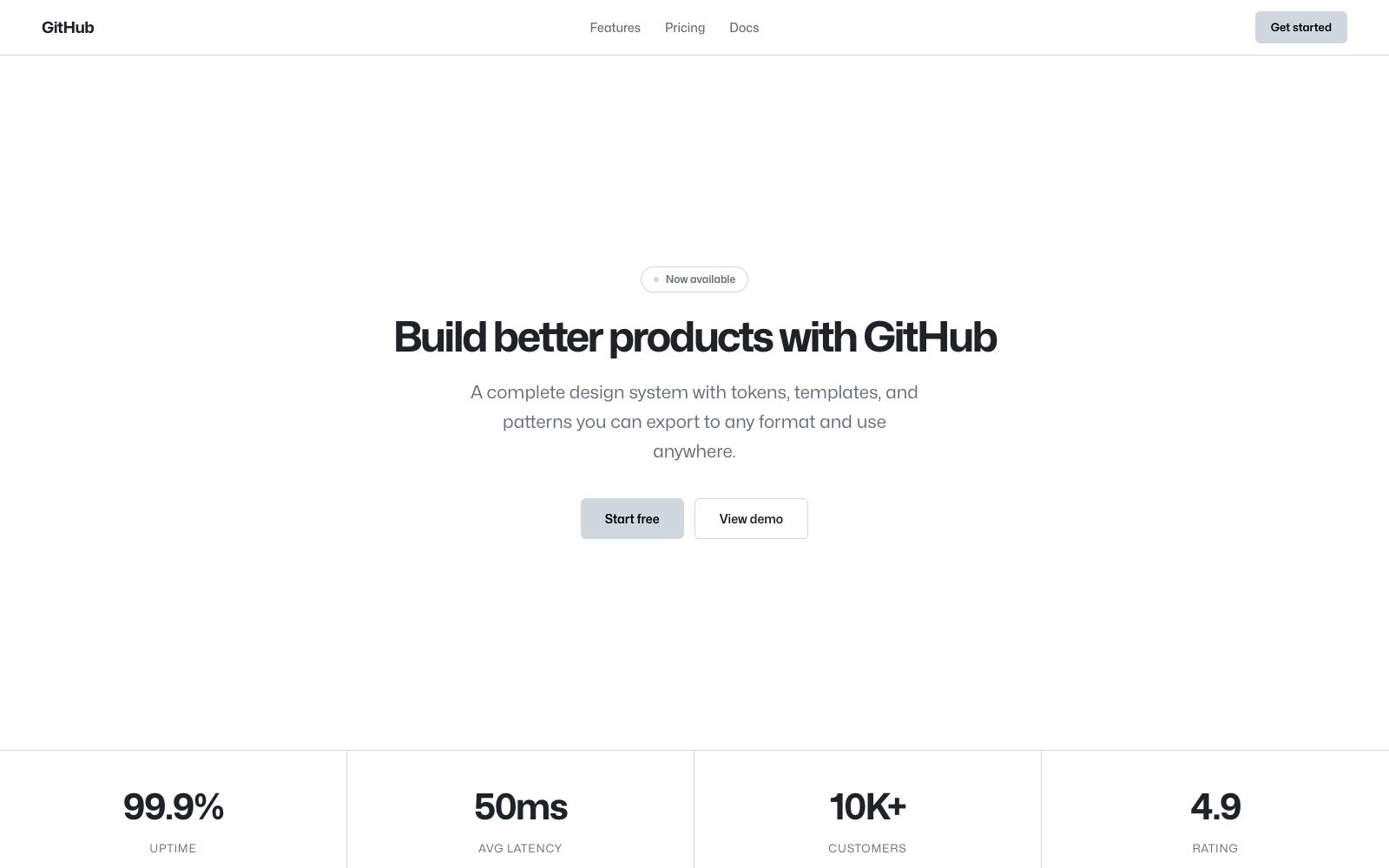
Utilitarian, information-dense, developer-familiar — GitHub Primer system.

Developer-native surface with a muted blue hierarchy, octocats, and systematic density.

## Color palette and roles
- **Canvas Default (#ffffff)**: Page background (light mode).
- **Canvas Subtle (#f6f8fa)**: Code blocks, sidebar fills.
- **Border Default (#d0d7de)**: Card borders, dividers.
- **Fg Muted (#656d76)**: Secondary text, timestamps.
- **Fg Default (#1f2328)**: Primary text and headings.
- **Accent Blue (#0969da)**: Links, active nav items.
- **Success Green (#1a7f37)**: Merged PRs, passing checks.
- **Danger Red (#cf222e)**: Deletions, failed checks.

## Typography rules
- **Display**: Mona Sans, 700, 48px. Marketing and campaign pages.
- **Body**: -apple-system, BlinkMacSystemFont, Segoe UI, 400, 14px. Repository content and UI text.
- **Code**: ui-monospace, SFMono-Regular, Menlo, 400, 12px. Code views, diffs, terminal output.

## Spacing and shape
- Base unit: 4px.
- Default gap: 16px.
- Card padding: 16px.
- Section padding: 48px.
- Card corners: 6px.
- Control corners: 6px.
- Pills: 9999px.

## Motion
Use still motion. Fast feedback lasts 80ms; composed transitions last 200ms; easing is cubic-bezier(0.3, 0, 0.5, 1).

## Guardrails
- Use the system font stack for product UI — reserve Mona Sans for marketing.
- Keep body text at 14px — denser than most SaaS products.
- Use a 4px base grid for tight information density.
- Apply 6px radius uniformly across all surfaces and controls.
- Use semantic colors (green/red/blue/yellow) for status, never for decoration.
---
name: "GitHub"
mode: "adaptive"
---

# GitHub

## Visual theme and atmosphere
Utilitarian, information-dense, developer-familiar — GitHub Primer system.

Developer-native surface with a muted blue hierarchy, octocats, and systematic density.

## Color palette and roles
- **Canvas Default (#ffffff)**: Page background (light mode).
- **Canvas Subtle (#f6f8fa)**: Code blocks, sidebar fills.
- **Border Default (#d0d7de)**: Card borders, dividers.
- **Fg Muted (#656d76)**: Secondary text, timestamps.
- **Fg Default (#1f2328)**: Primary text and headings.
- **Accent Blue (#0969da)**: Links, active nav items.
- **Success Green (#1a7f37)**: Merged PRs, passing checks.
- **Danger Red (#cf222e)**: Deletions, failed checks.

## Typography rules
- **Display**: Mona Sans, 700, 48px. Marketing and campaign pages.
- **Body**: -apple-system, BlinkMacSystemFont, Segoe UI, 400, 14px. Repository content and UI text.
- **Code**: ui-monospace, SFMono-Regular, Menlo, 400, 12px. Code views, diffs, terminal output.

## Spacing and shape
- Base unit: 4px.
- Default gap: 16px.
- Card padding: 16px.
- Section padding: 48px.
- Card corners: 6px.
- Control corners: 6px.
- Pills: 9999px.

## Motion
Use still motion. Fast feedback lasts 80ms; composed transitions last 200ms; easing is cubic-bezier(0.3, 0, 0.5, 1).

## Guardrails
- Use the system font stack for product UI — reserve Mona Sans for marketing.
- Keep body text at 14px — denser than most SaaS products.
- Use a 4px base grid for tight information density.
- Apply 6px radius uniformly across all surfaces and controls.
- Use semantic colors (green/red/blue/yellow) for status, never for decoration.
---
name: "GitHub"
mode: "adaptive"
---

# GitHub

## Visual theme and atmosphere
Utilitarian, information-dense, developer-familiar — GitHub Primer system.

Developer-native surface with a muted blue hierarchy, octocats, and systematic density.

## Color palette and roles
- **Canvas Default (#ffffff)**: Page background (light mode).
- **Canvas Subtle (#f6f8fa)**: Code blocks, sidebar fills.
- **Border Default (#d0d7de)**: Card borders, dividers.
- **Fg Muted (#656d76)**: Secondary text, timestamps.
- **Fg Default (#1f2328)**: Primary text and headings.
- **Accent Blue (#0969da)**: Links, active nav items.
- **Success Green (#1a7f37)**: Merged PRs, passing checks.
- **Danger Red (#cf222e)**: Deletions, failed checks.

## Typography rules
- **Display**: Mona Sans, 700, 48px. Marketing and campaign pages.
- **Body**: -apple-system, BlinkMacSystemFont, Segoe UI, 400, 14px. Repository content and UI text.
- **Code**: ui-monospace, SFMono-Regular, Menlo, 400, 12px. Code views, diffs, terminal output.

## Spacing and shape
- Base unit: 4px.
- Default gap: 16px.
- Card padding: 16px.
- Section padding: 48px.
- Card corners: 6px.
- Control corners: 6px.
- Pills: 9999px.

## Motion
Use still motion. Fast feedback lasts 80ms; composed transitions last 200ms; easing is cubic-bezier(0.3, 0, 0.5, 1).

## Guardrails
- Use the system font stack for product UI — reserve Mona Sans for marketing.
- Keep body text at 14px — denser than most SaaS products.
- Use a 4px base grid for tight information density.
- Apply 6px radius uniformly across all surfaces and controls.
- Use semantic colors (green/red/blue/yellow) for status, never for decoration.
---
name: "GitHub"
mode: "adaptive"
---

# GitHub

## Visual theme and atmosphere
Utilitarian, information-dense, developer-familiar — GitHub Primer system.

Developer-native surface with a muted blue hierarchy, octocats, and systematic density.

## Color palette and roles
- **Canvas Default (#ffffff)**: Page background (light mode).
- **Canvas Subtle (#f6f8fa)**: Code blocks, sidebar fills.
- **Border Default (#d0d7de)**: Card borders, dividers.
- **Fg Muted (#656d76)**: Secondary text, timestamps.
- **Fg Default (#1f2328)**: Primary text and headings.
- **Accent Blue (#0969da)**: Links, active nav items.
- **Success Green (#1a7f37)**: Merged PRs, passing checks.
- **Danger Red (#cf222e)**: Deletions, failed checks.

## Typography rules
- **Display**: Mona Sans, 700, 48px. Marketing and campaign pages.
- **Body**: -apple-system, BlinkMacSystemFont, Segoe UI, 400, 14px. Repository content and UI text.
- **Code**: ui-monospace, SFMono-Regular, Menlo, 400, 12px. Code views, diffs, terminal output.

## Spacing and shape
- Base unit: 4px.
- Default gap: 16px.
- Card padding: 16px.
- Section padding: 48px.
- Card corners: 6px.
- Control corners: 6px.
- Pills: 9999px.

## Motion
Use still motion. Fast feedback lasts 80ms; composed transitions last 200ms; easing is cubic-bezier(0.3, 0, 0.5, 1).

## Guardrails
- Use the system font stack for product UI — reserve Mona Sans for marketing.
- Keep body text at 14px — denser than most SaaS products.
- Use a 4px base grid for tight information density.
- Apply 6px radius uniformly across all surfaces and controls.
- Use semantic colors (green/red/blue/yellow) for status, never for decoration.
---
name: "GitHub"
mode: "adaptive"
---

# GitHub

## Visual theme and atmosphere
Utilitarian, information-dense, developer-familiar — GitHub Primer system.

Developer-native surface with a muted blue hierarchy, octocats, and systematic density.

## Color palette and roles
- **Canvas Default (#ffffff)**: Page background (light mode).
- **Canvas Subtle (#f6f8fa)**: Code blocks, sidebar fills.
- **Border Default (#d0d7de)**: Card borders, dividers.
- **Fg Muted (#656d76)**: Secondary text, timestamps.
- **Fg Default (#1f2328)**: Primary text and headings.
- **Accent Blue (#0969da)**: Links, active nav items.
- **Success Green (#1a7f37)**: Merged PRs, passing checks.
- **Danger Red (#cf222e)**: Deletions, failed checks.

## Typography rules
- **Display**: Mona Sans, 700, 48px. Marketing and campaign pages.
- **Body**: -apple-system, BlinkMacSystemFont, Segoe UI, 400, 14px. Repository content and UI text.
- **Code**: ui-monospace, SFMono-Regular, Menlo, 400, 12px. Code views, diffs, terminal output.

## Spacing and shape
- Base unit: 4px.
- Default gap: 16px.
- Card padding: 16px.
- Section padding: 48px.
- Card corners: 6px.
- Control corners: 6px.
- Pills: 9999px.

## Motion
Use still motion. Fast feedback lasts 80ms; composed transitions last 200ms; easing is cubic-bezier(0.3, 0, 0.5, 1).

## Guardrails
- Use the system font stack for product UI — reserve Mona Sans for marketing.
- Keep body text at 14px — denser than most SaaS products.
- Use a 4px base grid for tight information density.
- Apply 6px radius uniformly across all surfaces and controls.
- Use semantic colors (green/red/blue/yellow) for status, never for decoration.